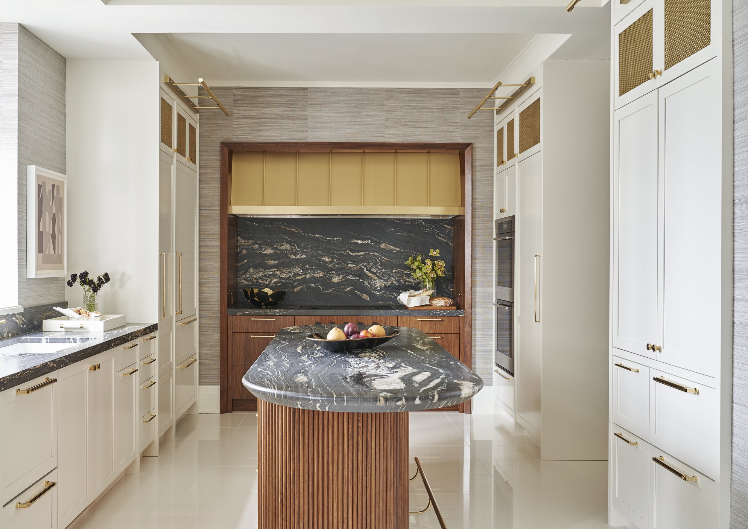
Interior Design - BK Interior Design / Photography - Mike Schwartz / Wallpaper - Phillip Jeffries / Hardware - Classic Brass / Lighting - Phoenix Day
The design process is always an evolution. Sometimes projects happen in one fell swoop, other times the scope gets broken out into different phases over time. Such has been the story of our Chicago Luxe project which began in 2018 and where we were recently called back to tackle a third phase of the project. This primarily revolved around the entryway and powder room with a few updates to the office and dining room.
All along we have remained consistent with our vision which was to reference the classical Art Deco roots of the building in a more modern way. We stayed steadfast with our colors and materials palette of black, white, walnut and brass. Its been fun to design and witness the transformation of this urban oasis over the years.
Elevator Lobby
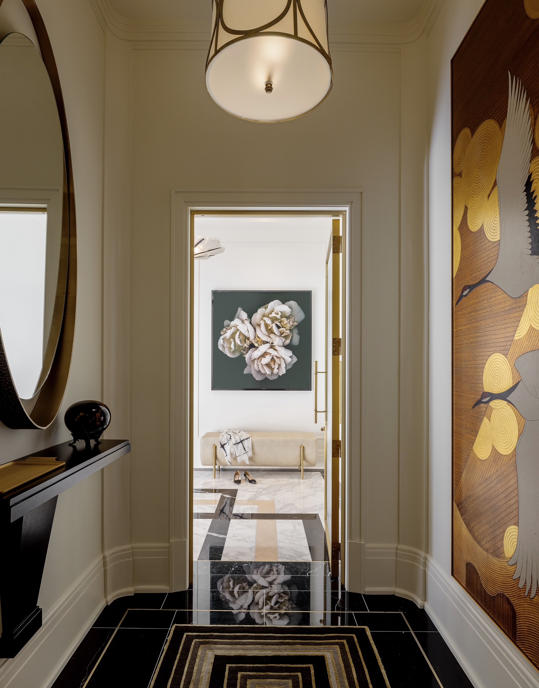
Art Photography - Chad Kleistsch / Bench - Natasha Baradaran / Art - DeGournay
We wanted to design a space that is equal parts timeless and classic as it is modern. We juxtaposed traditional casing and trim with modern furnishings., however it the the floor this is the real showstopper! We created a zig zag pattern out of marble slabs that help lead the way from the entry to the main living space. It’s a bold graphic moment that energizes the room and ties together all the materials used throughout the apartment.
Entry
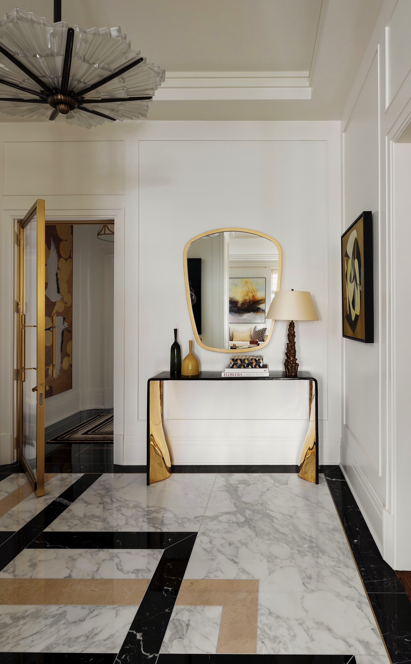
Entry console - Elan Atelier / Lamp - Vaughan Designs / Art - Richard Norton Gallery / Rug - The Rug Company / Mirror - Tom Faulkner
The apartments in this building each occupy a full floor, so the elevator opens up to a foyer for each unit which in turn opens up to the apartments entry. We wanted to create a special entry door and designed a brass and a reeded glass door that welcomes guests and sets the tone for the deco-luxe space.
Powder Room
Wallpaper - Phillip Jeffries / Faucet - Kallista / Sconces - Vintage
We love small spaces that pack a punch and this powder room does just that. We opted for a moody vibe achieved through rich black grass cloth that is hand painted with dripping gold accents. The reeded walnut vanity is topped with Nero Marquina marble which also shows up in the lever handles of the faucet. Vintage Kalmar glass sconces complete the look.
Dining Room
Art - Daniel Mullen
The dining room was largely furnished with client existing furniture including the dining table and chairs. We designed a custom walnut credenza with shagreen door fronts and sourced a vintage Venini chandelier for the space. However it’s the artwork we sourced that really activates this space and provides an unexpected jolt of color and modernism to an otherwise traditional space.
Living Room
Art - Tomas Capobianco / Reupholstery - Eurocraft Inc / Pillow Fabric - Calvin Fabrics
Similar to the dining room, the living room was largely furnished with client existing furniture that we recovered. White chenille, brown tweed, and hints of gold make up the textile palette. We also design a stepped fireplace surround in Nero Marquina and love how well the fabricator lined up the veining for a seamless monolithic look.
Office
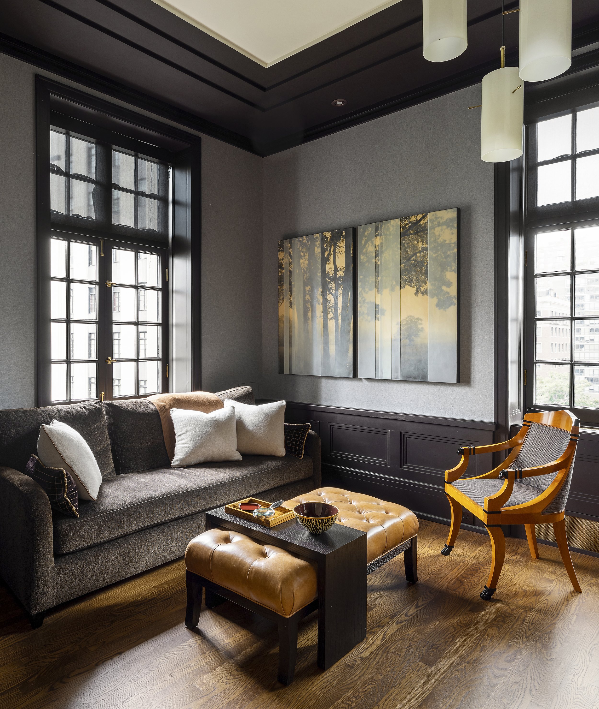
Light Fixture - Object Culture / Wallpaper - Phillip Jeffries / Widow Coverings - Zirlin Interiors
The office. Reviving the old, we reupholstered a familiar sofa in a rich dark brown and gold chenille fabric, infusing a touch of opulence. The mood of the room is created by the slate blue flannel wallpaper for a stately feel.
Its been fun to revisit a project - not once, not twice but three times over the last 5 years and each time continue to develop the design we set forth at the beginning. Layer by layer, detail by detail its been a joy watching the overall vision come to life.


