Excerpts taken from a Spring 2021 feature in Rue Magazine, available online and on newsstands now
A CLOSER LOOK AT BRAD KREFMAN’S
COUNTRY ECLECTIC PROJECT FROM OUR SPRING ISSUE
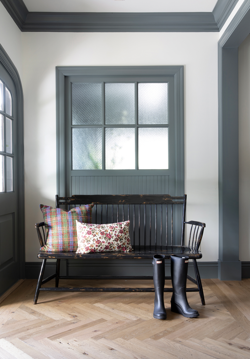
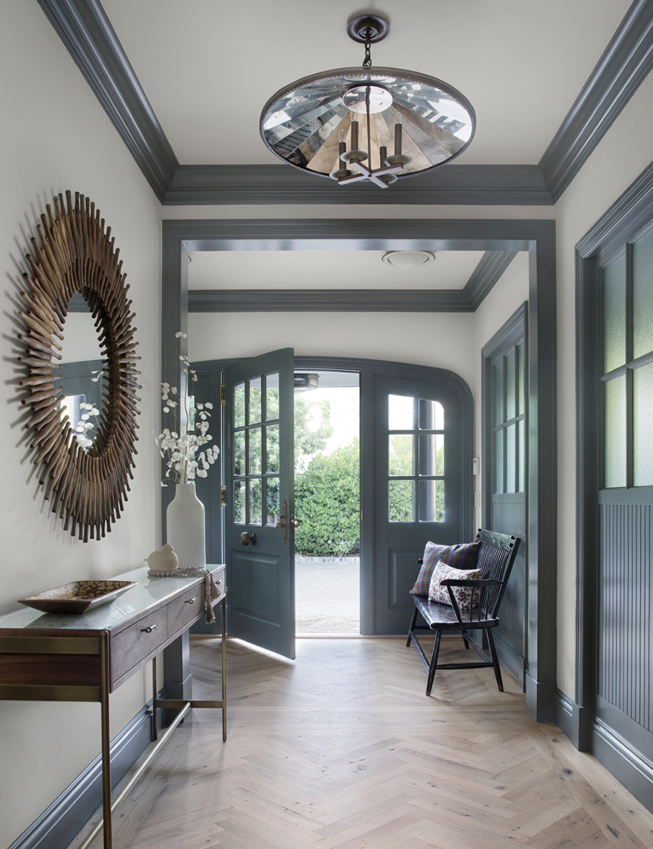
If you’ve picked up a copy of the spring (and first-ever print) issue of the magazine, you know we kicked things off with an English-inspired entryway by California designer Brad Krefman. “An entryway is the first impression and sets the stage for the home’s look and feel,” he told us. Turns out, this entry really was just a taste of what was to come. This Marin County home for a mom and her three teenage daughters is a little bit country, a little bit eclectic, and a whole lot of fun.
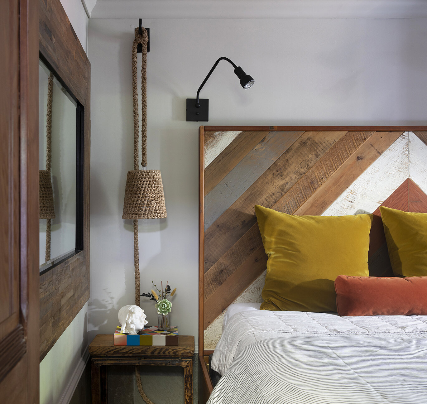
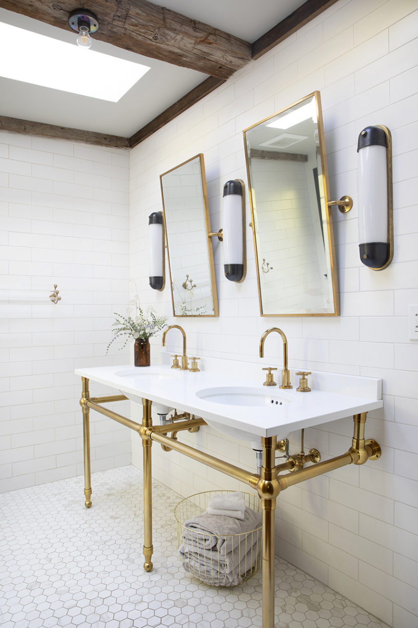
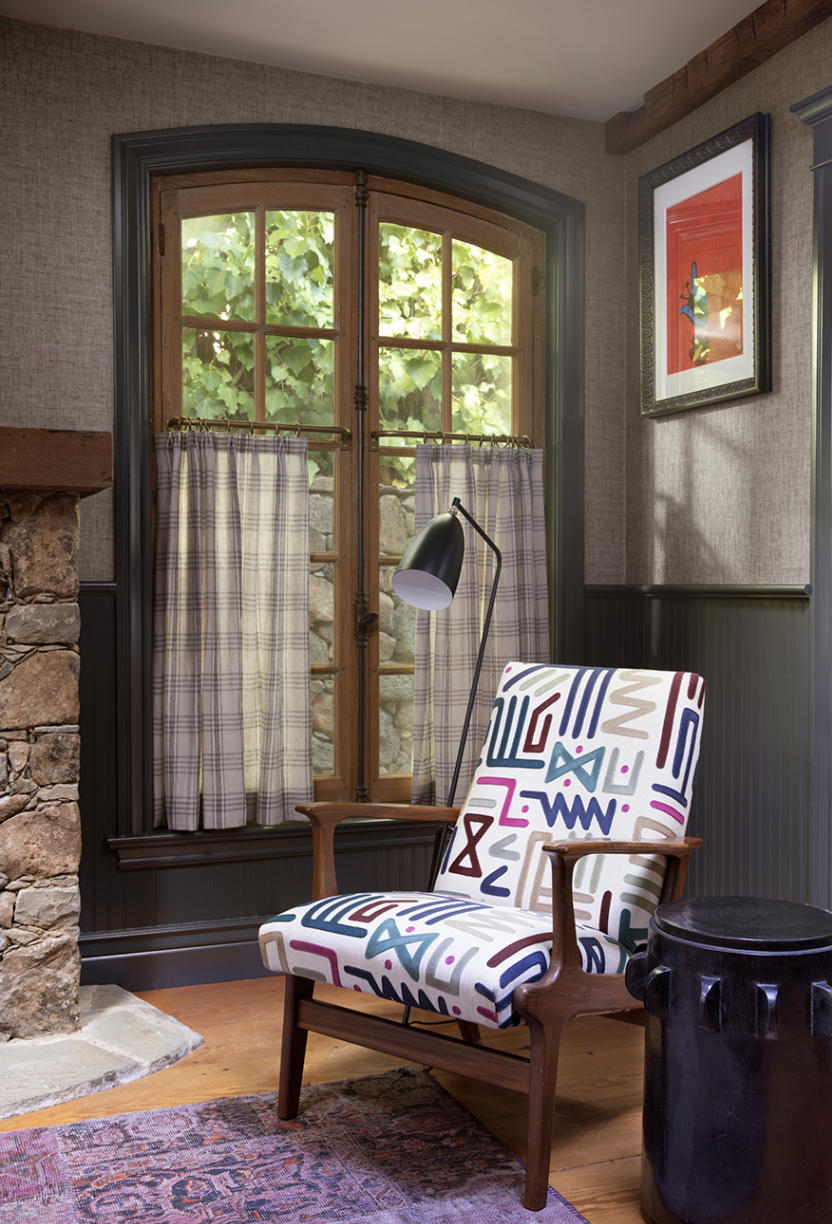
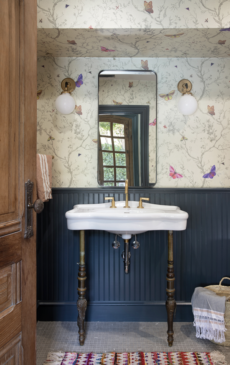
Hi Brad! Tell us about the property. Where is it located and how did that influence the design, if at all?
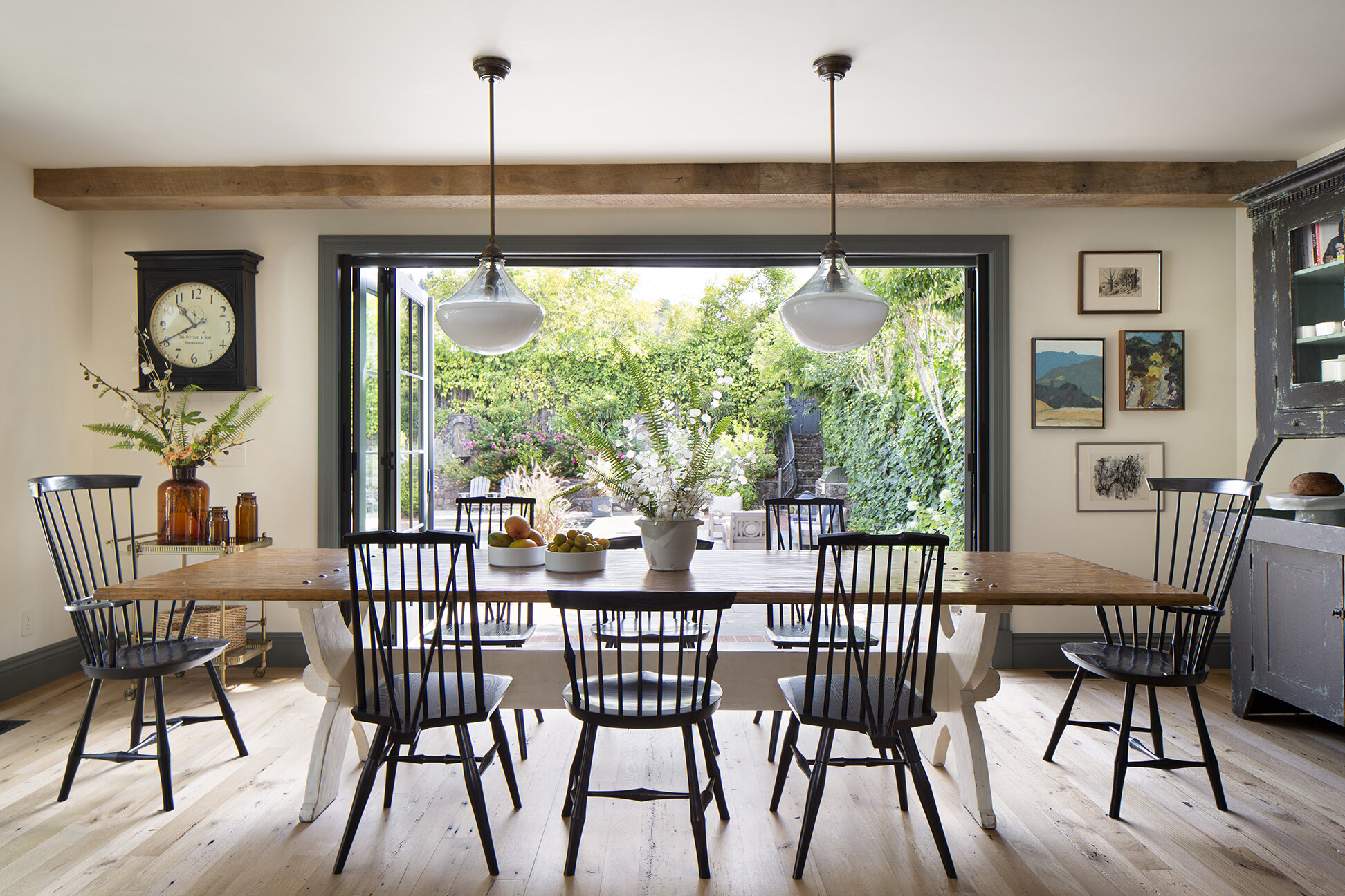
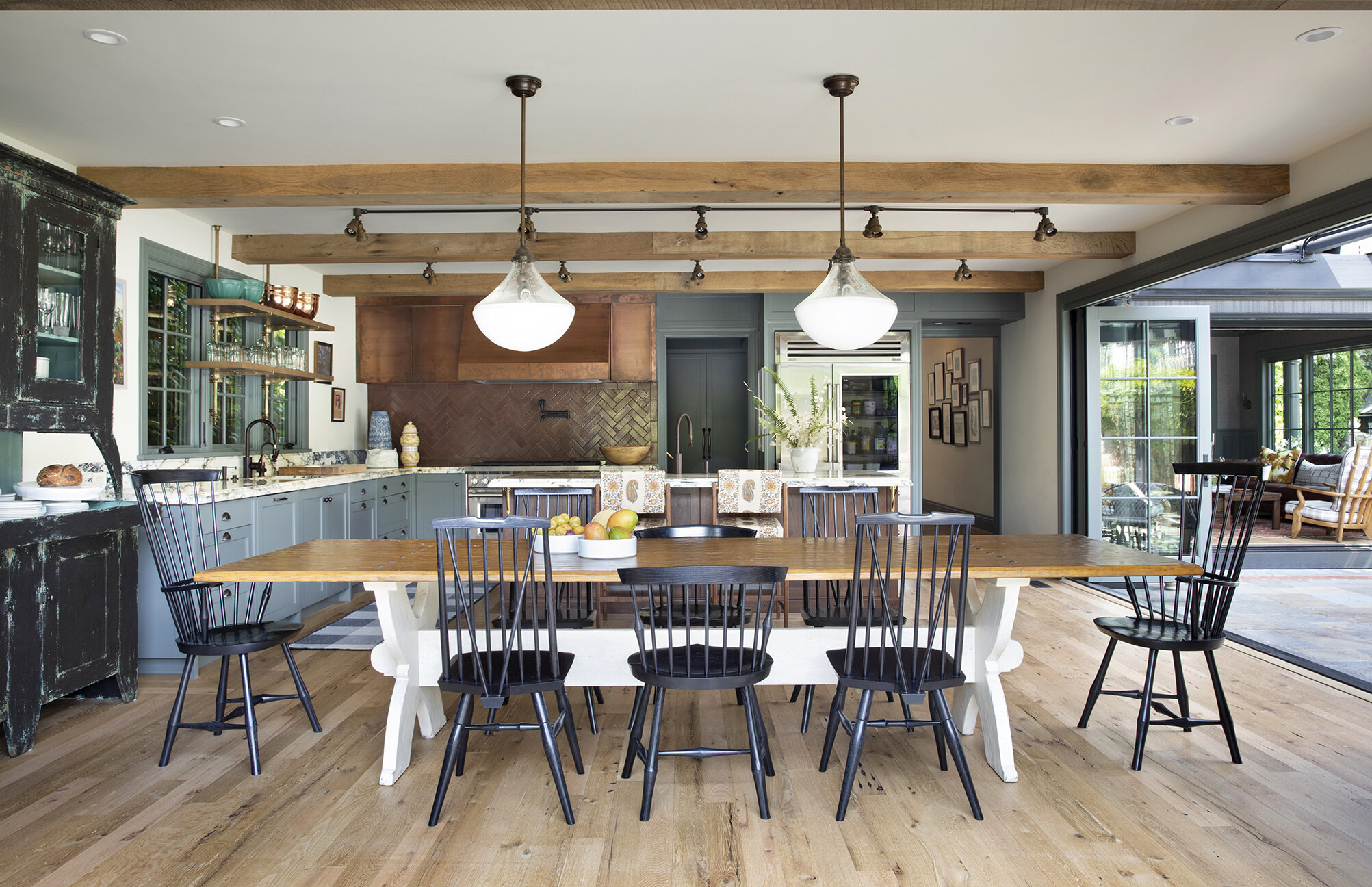
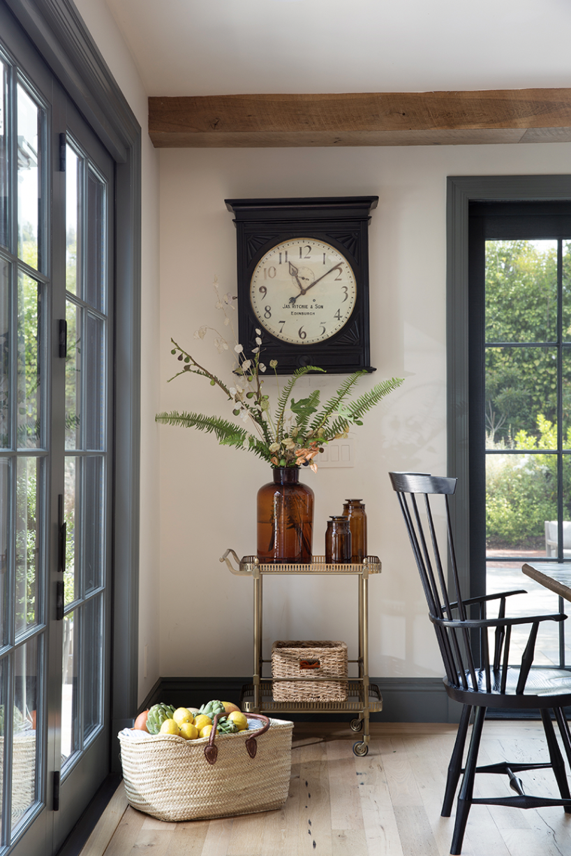
Our design philosophy always references context, purpose, and place. In this case it’s a centuries old house in Marin county. We were definitely inspired by the property’s history and wanted to create a design that channeled old world charm in a more current and reimagined way.
What can you tell us about the client?
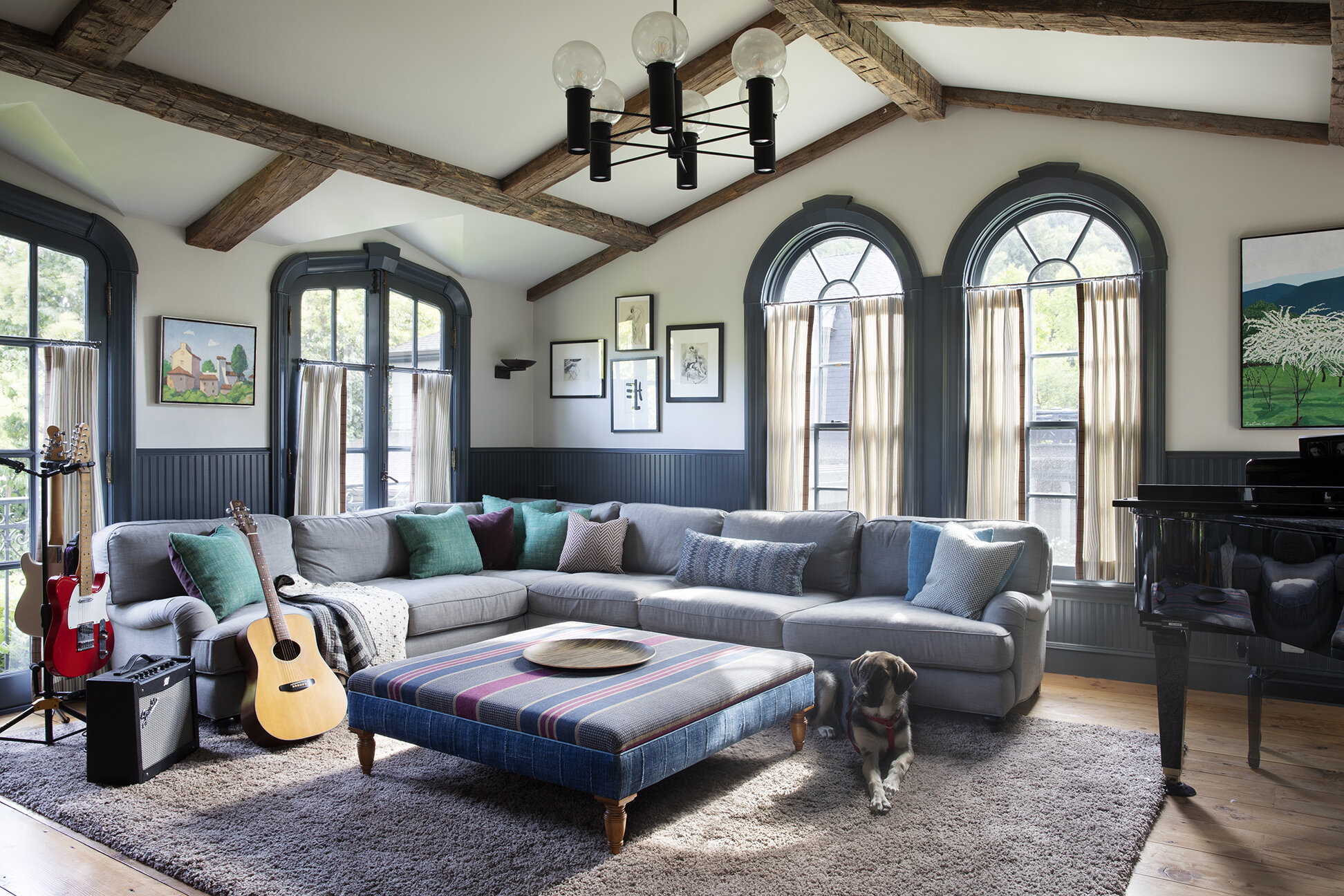
The house is occupied by a family of four–a mom and her three amazing teenage girls. This is a super creative bunch of ladies who have fun and whimsical personalities. Our client wanted a comfortable house that felt lived in and not too pretentious. We were tasked with creating something that referenced classical design, with a tad of country, and a splash of whimsy.
What were their top priorities in this space? Any must-haves or “absolutely nots”?
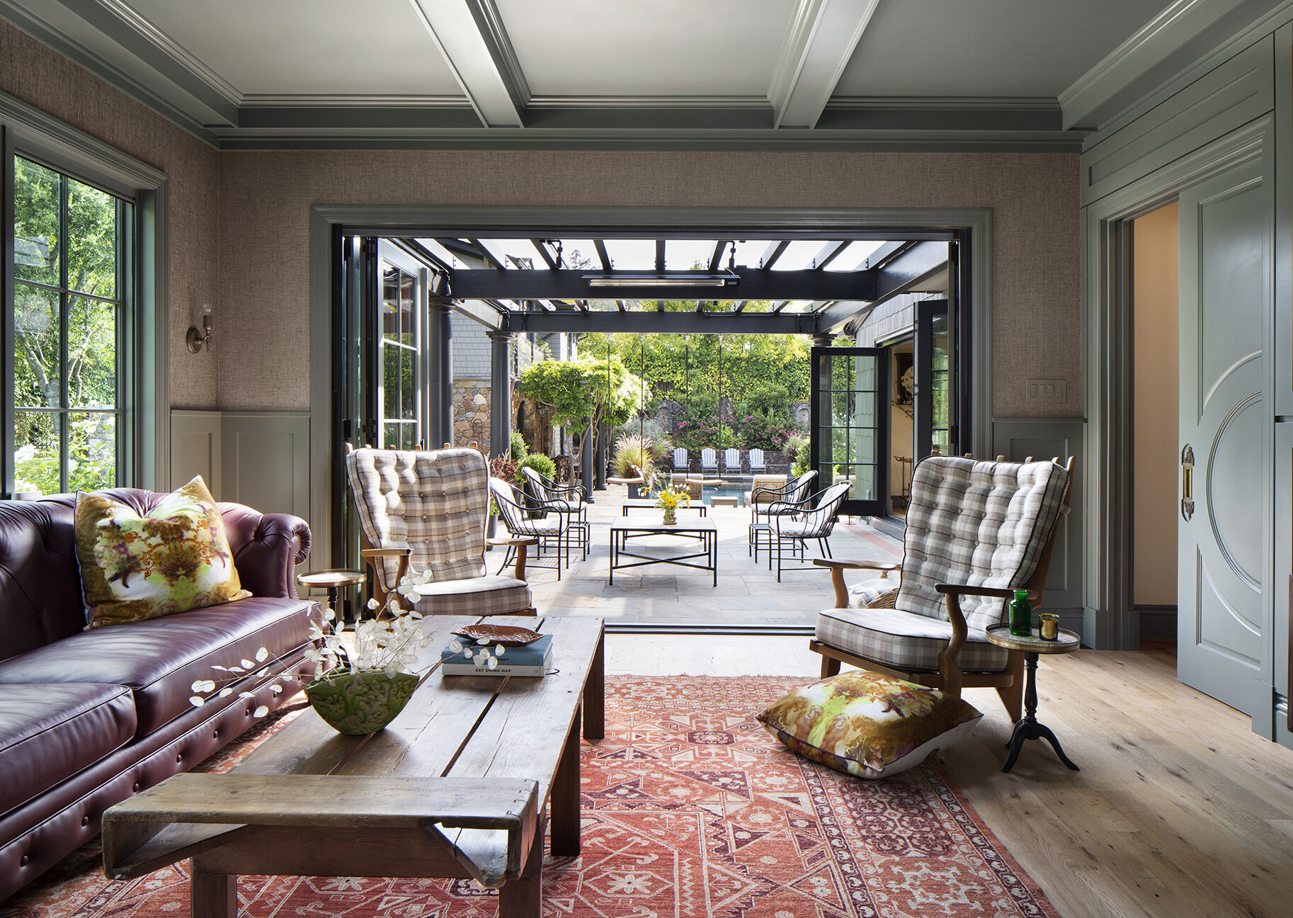
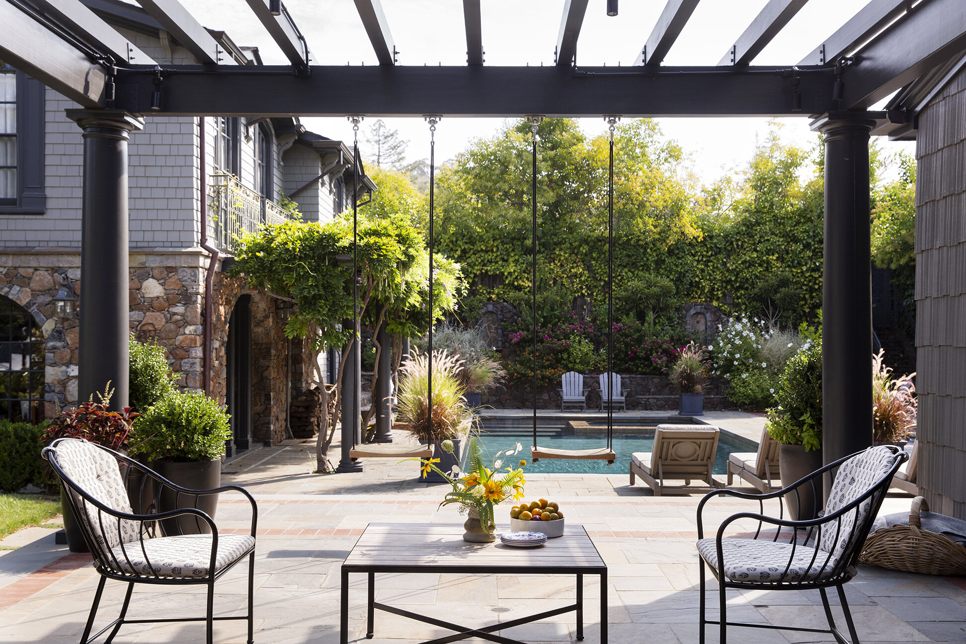
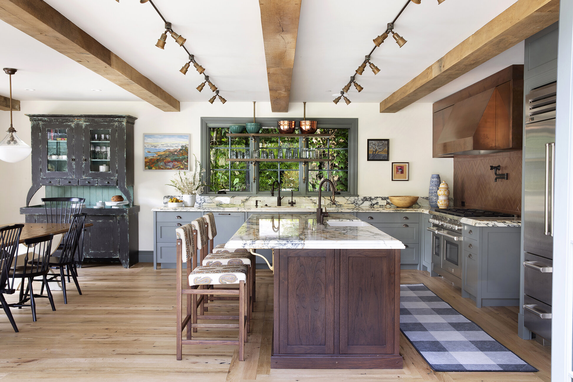
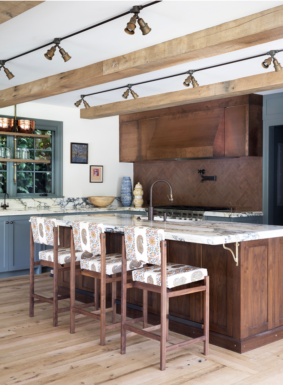
Being in California, we wanted to create a strong connection to the outdoors and the larger property. We worked with Polsky Perlstein Architects to create large openings in the house that connect the patio and pool area. We also redefined the kitchen area which was previously small and dark. The space called for a combined kitchen/dining area for large family gatherings that serves as the hub of the house.
There are a lot of beautiful patterns and color here. Is there one item you feel was a jumping off point for the design?
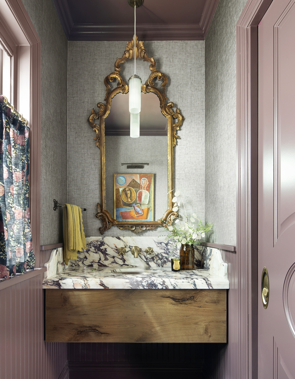
A trip to England provided no shortage of design and pattern inspiration. The English are so good at mixing colors and patterns in a seemingly effortless manner. It was fun to take a cue from them and let our imagination run wild. Thankfully, our client loves color and pattern, so we had fun mixing things up in unexpected ways. We combined vintage textiles from some sources down in Los Angeles including Hollywood at Home, and also some fun whimsical designs from Timorous Beasties in London.
Are there any details that you feel especially made the space?
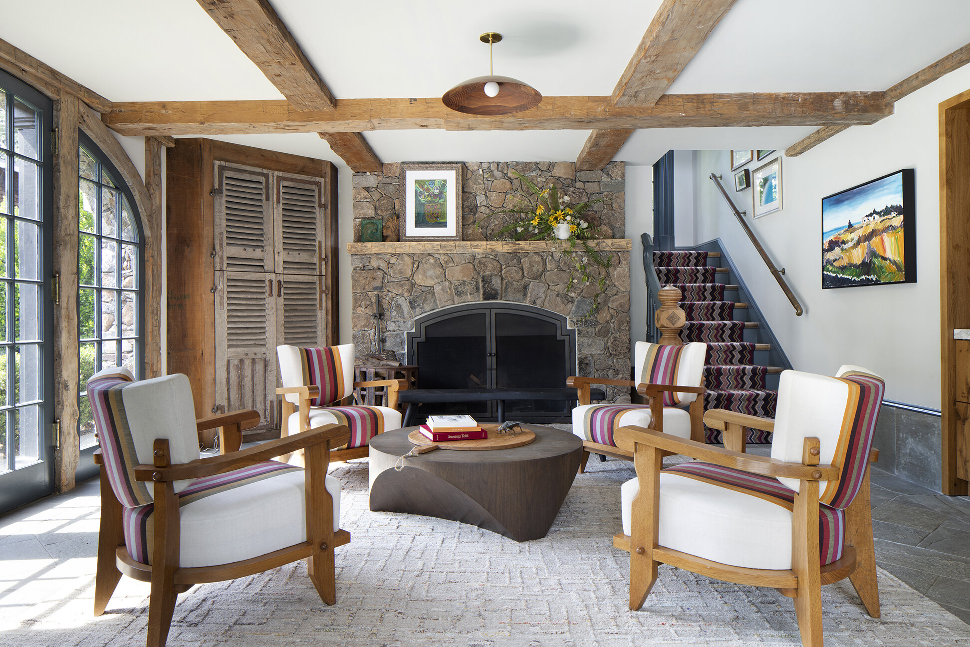
Personally, I love the swings on the patio. They are super fun and bring out the kid in all of us. Also, the living room and bar area of the pool house is my favorite interior space of the house. The room already had so much old-world charm in the beams and fireplace, so it was a treat selecting the right furniture in there. We chose amazing vintage Guillerme and Chambron chairs and upholstered them in a striking stripe by Christopher Farr. They are so chic – I just love them!
How long did this project take?
The project was completed in two phases. We tackled the pool house first. The clients moved in here while we embarked on the main house. Overall, start to finish, it was just under a two-year endeavor. The excitement is palpable at the beginning of projects, then as we approach the finish line clients often get fatigued with decision making and budgets. Thankfully, the big reveal gives that perfect oomph at the end that reinvigorates all the excitement that existed at the start of the project.
Interior Designer: Brad Krefman Interior Design // Architect: Polsky Perlstein Architects
Contractor: Jesus Montes // Photographer: Paul Dyer
RUE is on newsstands now. Find a copy here.
