Excerpts taken from a Spring 2021 feature in Modern Luxury Magazine, available online and on newsstands now.
Interior Designer Brad Krefman transforms a vintage building condo into a stunning showcase of sophistication and style, all for the most discerning of clients–his parents.
The Client
A pair of empty nesters who moved from the Chicago suburbs to the city in their golden years wanted to give their condo in a 1920s Art Deco building a fresh look. The perfect interior designer for the job? Their son, Brad Krefman of BK Interior Design, who tackled the parental project in two phases.
The Priority
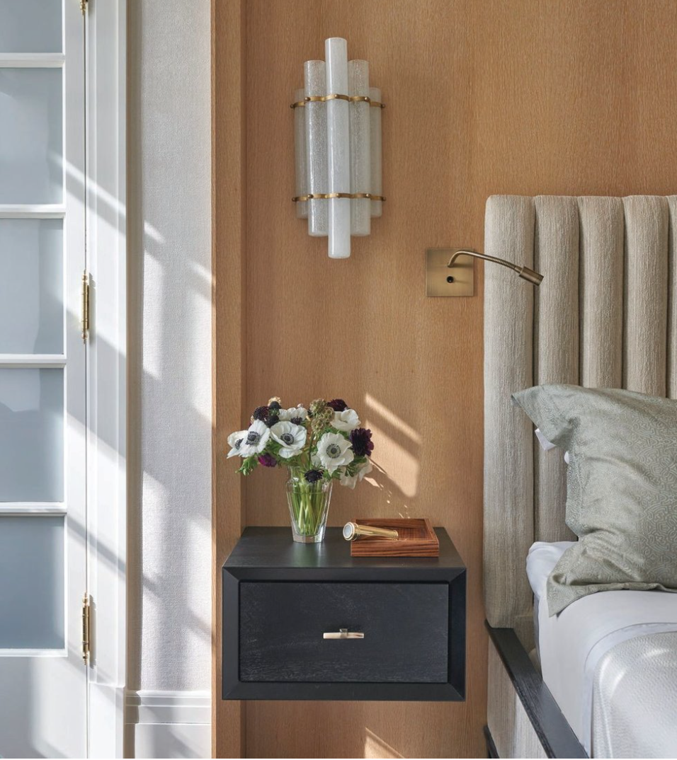
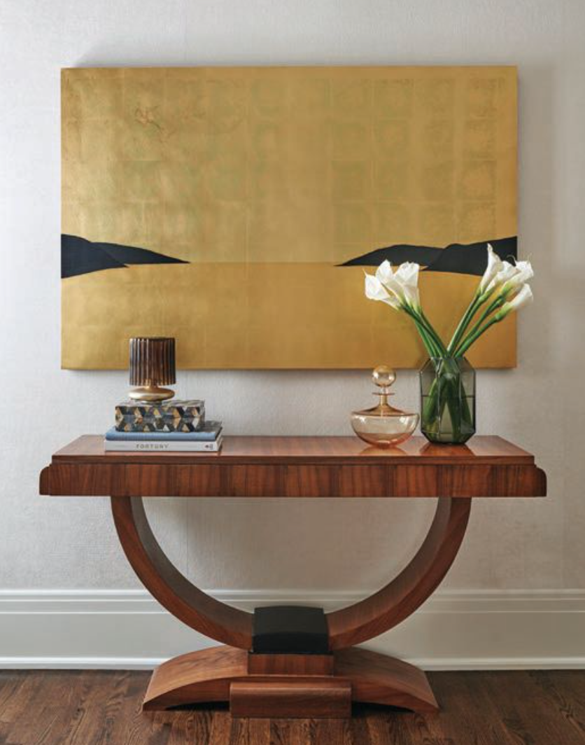
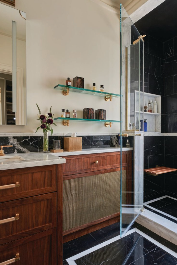
”They dreamed of a dwelling that felt classic yet modern and warm yet clean,” explains Krefman, stressing the teams’s respect for the space’s vintage character and the inspiration they found in the building’s Art Deco roots. “We curated a space derived from detail with an elevated sophistication that speaks to their love of both modern and classic styles; the restrained materials palette of neutrals, blacks and brass embraces the nuances of texture and quality that add a richness to the space.”
The Challenge
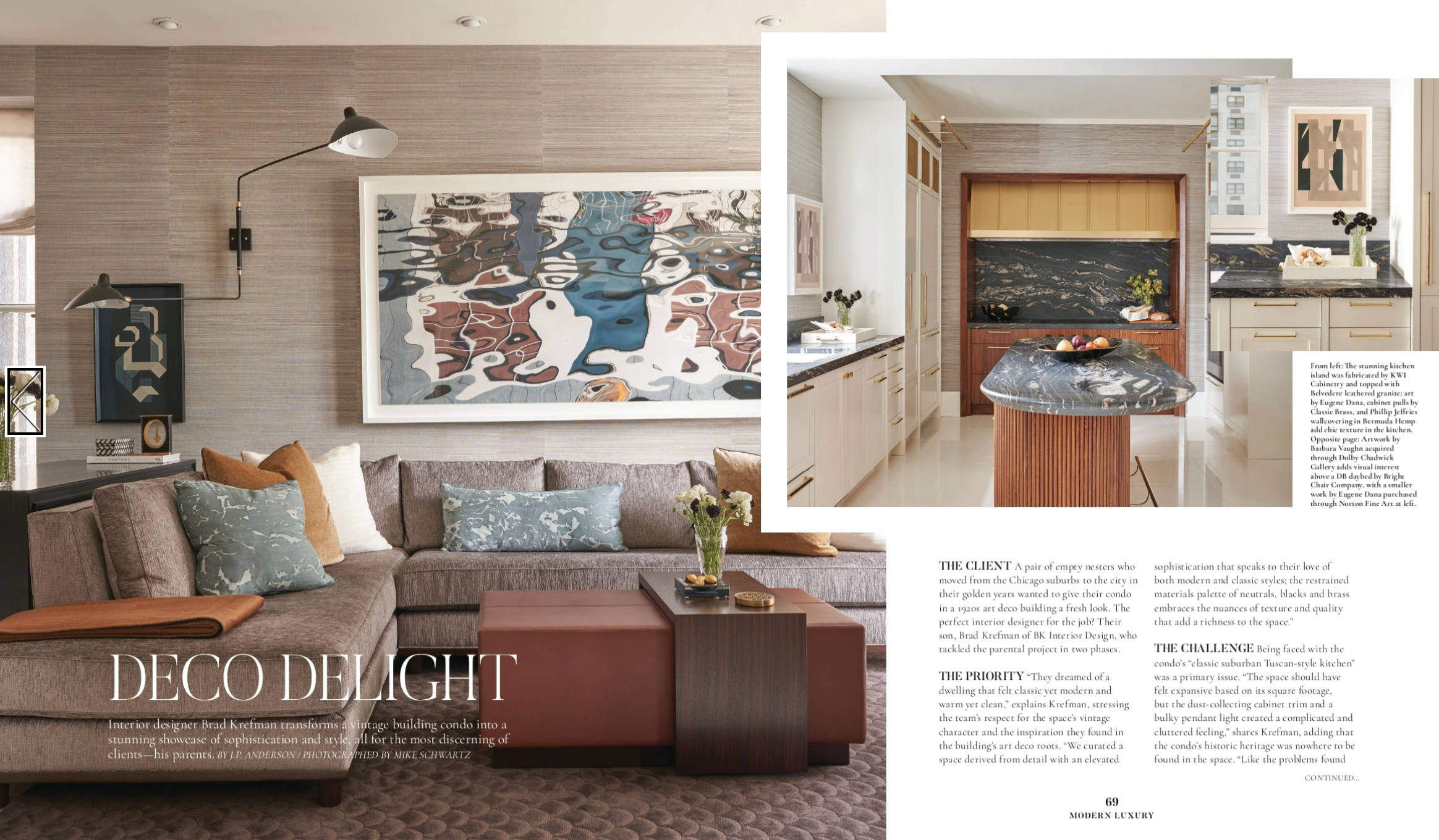
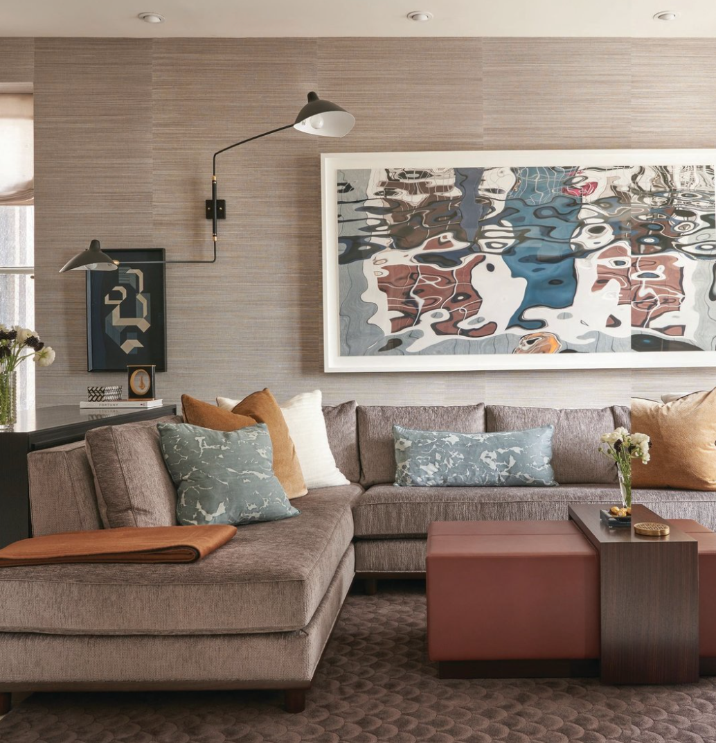
Being faced with the condo’s “classic suburban Tuscan-style kitchen” was a primary issue. “The space should have felt expansive based on its square footage, but the dust-collecting cabinet trim and a bulky pendant light created a complicated and cluttered feeling,” shared Krefman, adding that the condo’s historic heritage was nowhere to be found in the space. “Like the problems found in the kitchen, the existing living room furniture and finishes were a vestige of their former life,” he explains. “These fluffy, oversize elements no longer fit their new lives as an urban, streamlined duo. Our goal was to elevate the sophistication of the interior by introducing a variety of luxurious textiles and finishes while eliminating the extraneous elements that visually clouded the area.”
The Detail
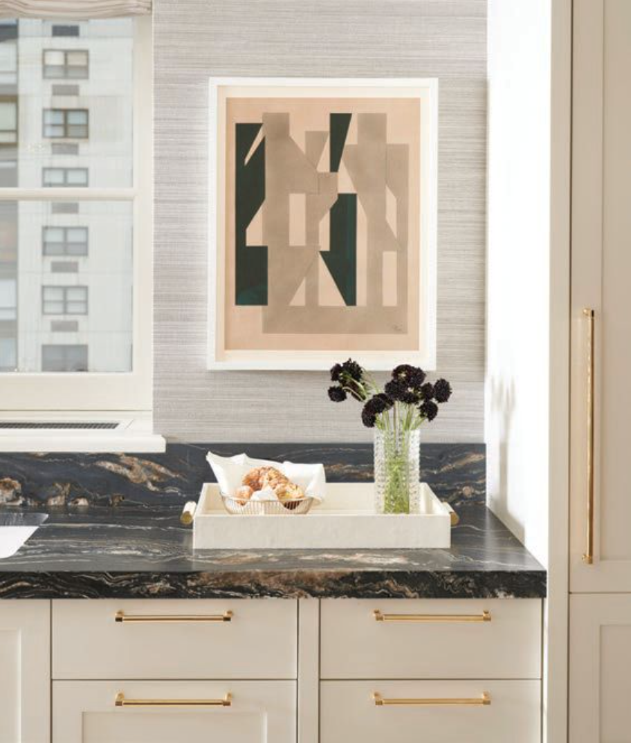
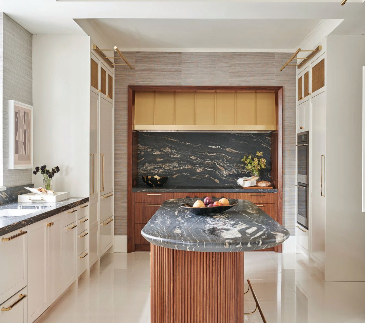
Krefman is particularly proud of the kitchen’s new look. “We crafted our design around clean white cabinets, refreshed ceiling and brightly polished porcelain floors,” notes the designer, “all intended to maximize and reflect as much light as possible. The rich, black granite creates a dramatic contrast, while the kinetic movement of its veins adds mesmerizing interest. We added warmth to the already luminous space by incorporating walnut at the island and range wall, and further distinguished the island as a piece of furniture, detailing it with a beautiful amour fascia and a reversed beveled edge at the countertop, and outfitting it with a functional and stylish brass foot rail. To balance the space, we introduced bold and geometric Bauhaus art pieces that reinforce the nod to old-world glam.”
The Outcome
The proud parents are thrilled with the results. “It was especially rewarding to return for phase two and see how well their kitchen and living space suited them and their lifestyle,” enthuses Krefman. “As this apartment got a second lease on life, I think, so, too, did they. They were left feeling inspired and with a new zest for their lives in the city.”
Photographer Mike Schwartz // Builders: Fraser Construction
