Jeff King & Company - Contractor l Builders Studio - Architect l John Merkl - Photographer
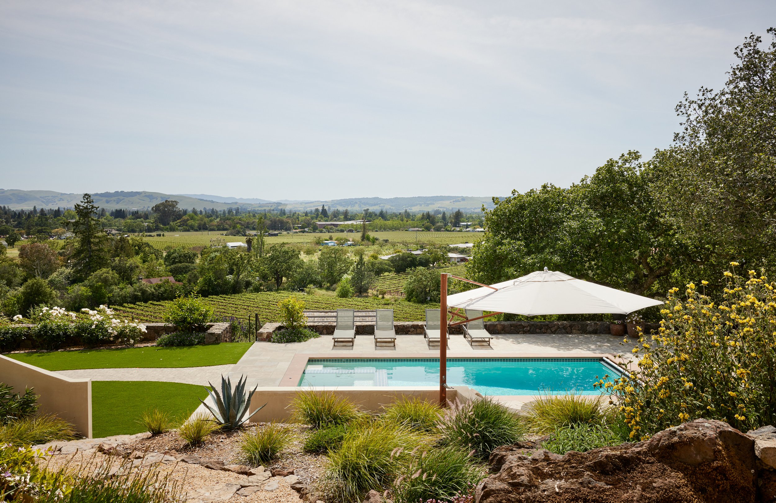
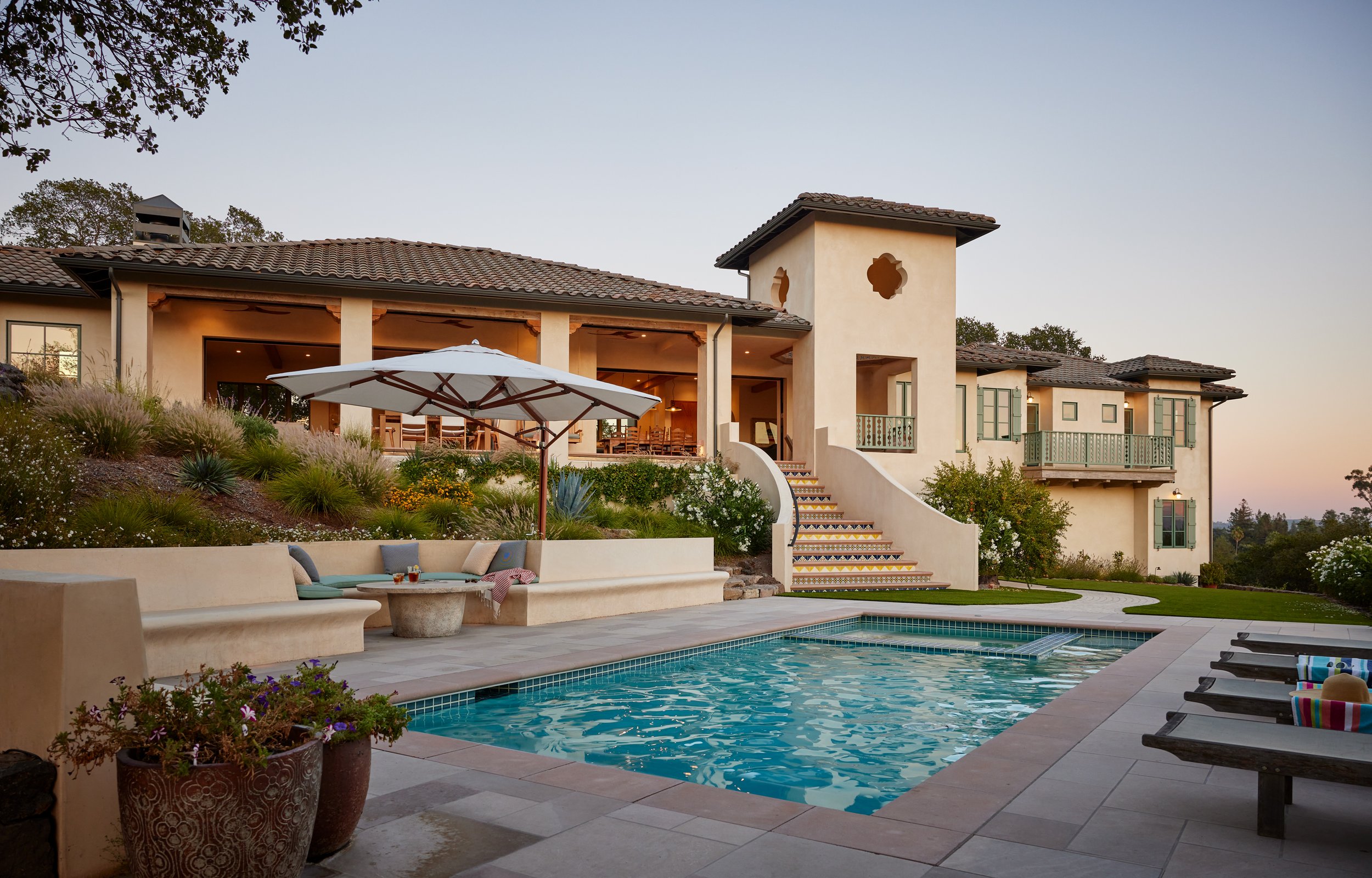
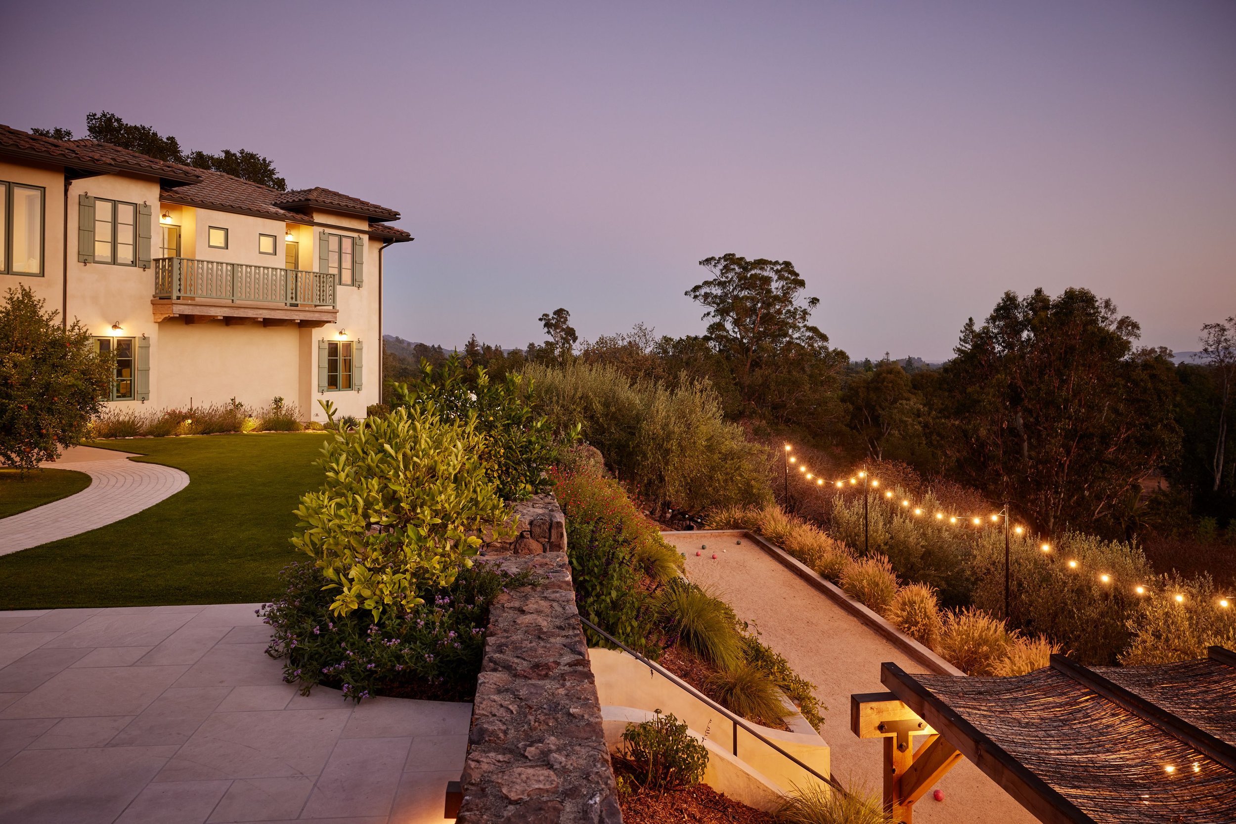
Seasons have changed. The Fall brings a cooling air and crisp light. In California’s wine country, harvest season is in full swing. We recently had the opportunity to visit a project in Sonoma, CA completed Summer of 2021. A true collaboration, this family house evokes the best of wine country living. Our design challenge was to create a Mediterranean-Mission aesthetic that is both original unto itself and rooted in local vernacular. It's a project that exemplifies our design ethos of always referencing context, purpose and place.
Our clients approached us in 2019 having already lived in the house for close to 7 years. But the house itself was nicely situated on the property. It just needed to be re-worked. My initial impression was that the house and property felt it lent itself to more of a Sonoma-Mission style than Tuscan which also resonated with our clients aesthetic preferences. We wanted to combine this with a Mediterranean vibe that would feel fresh, light and casual.
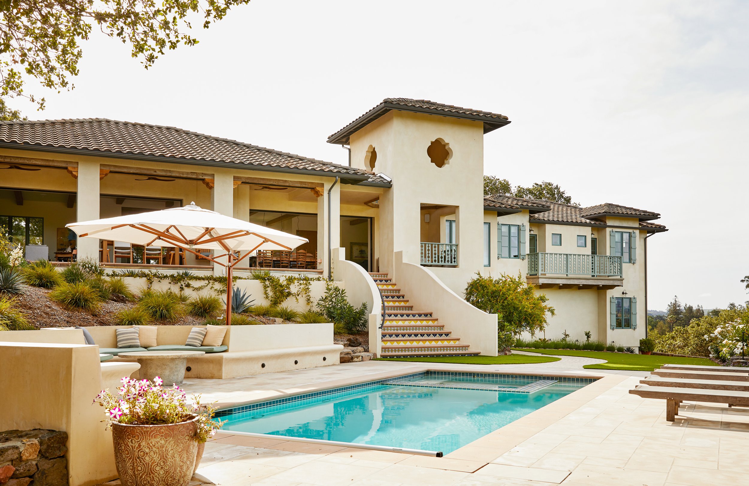
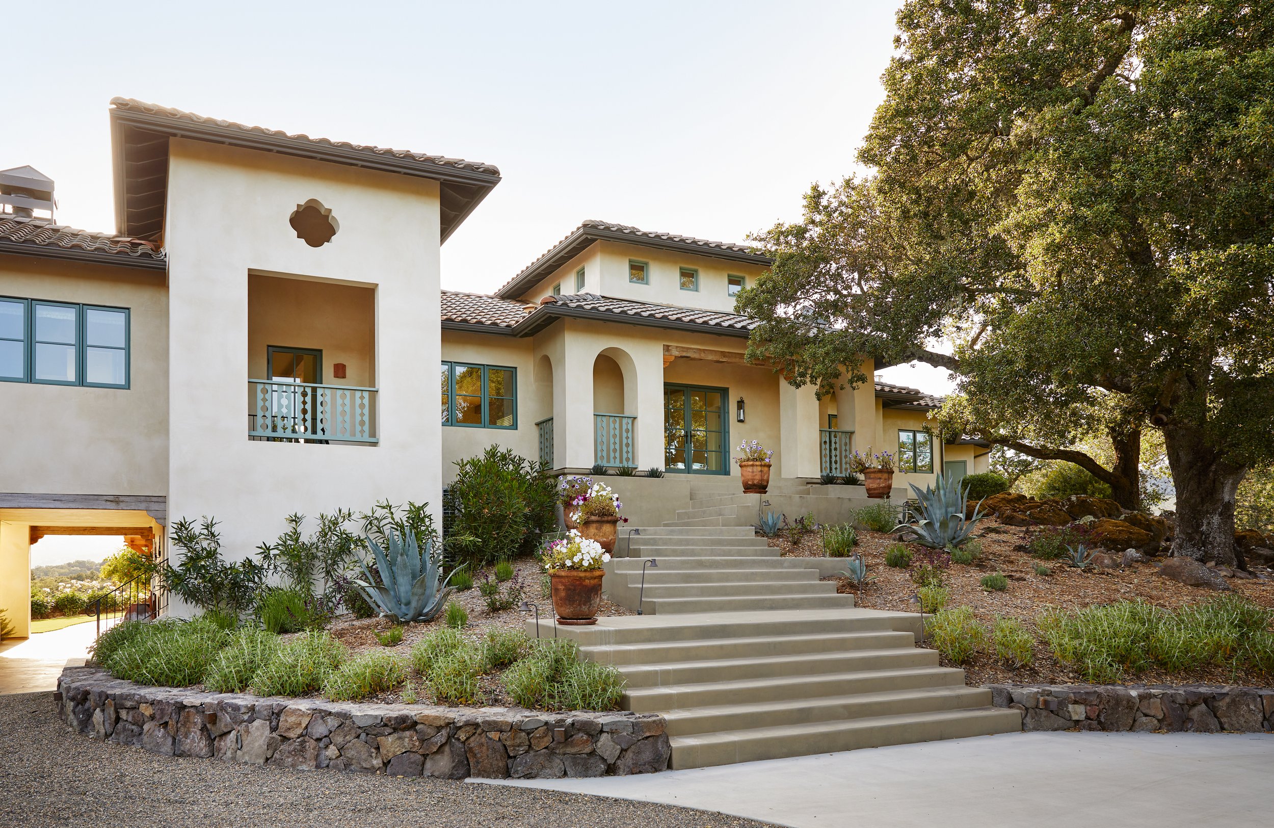
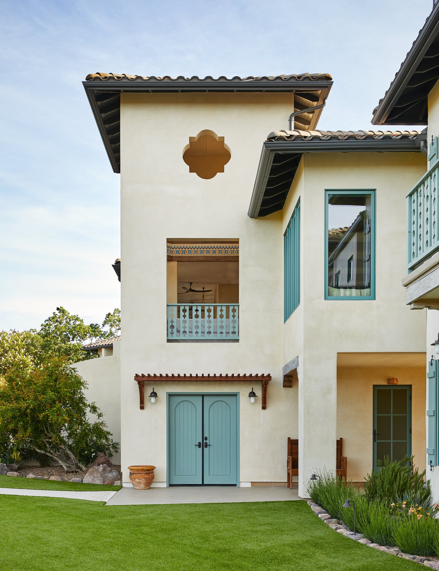
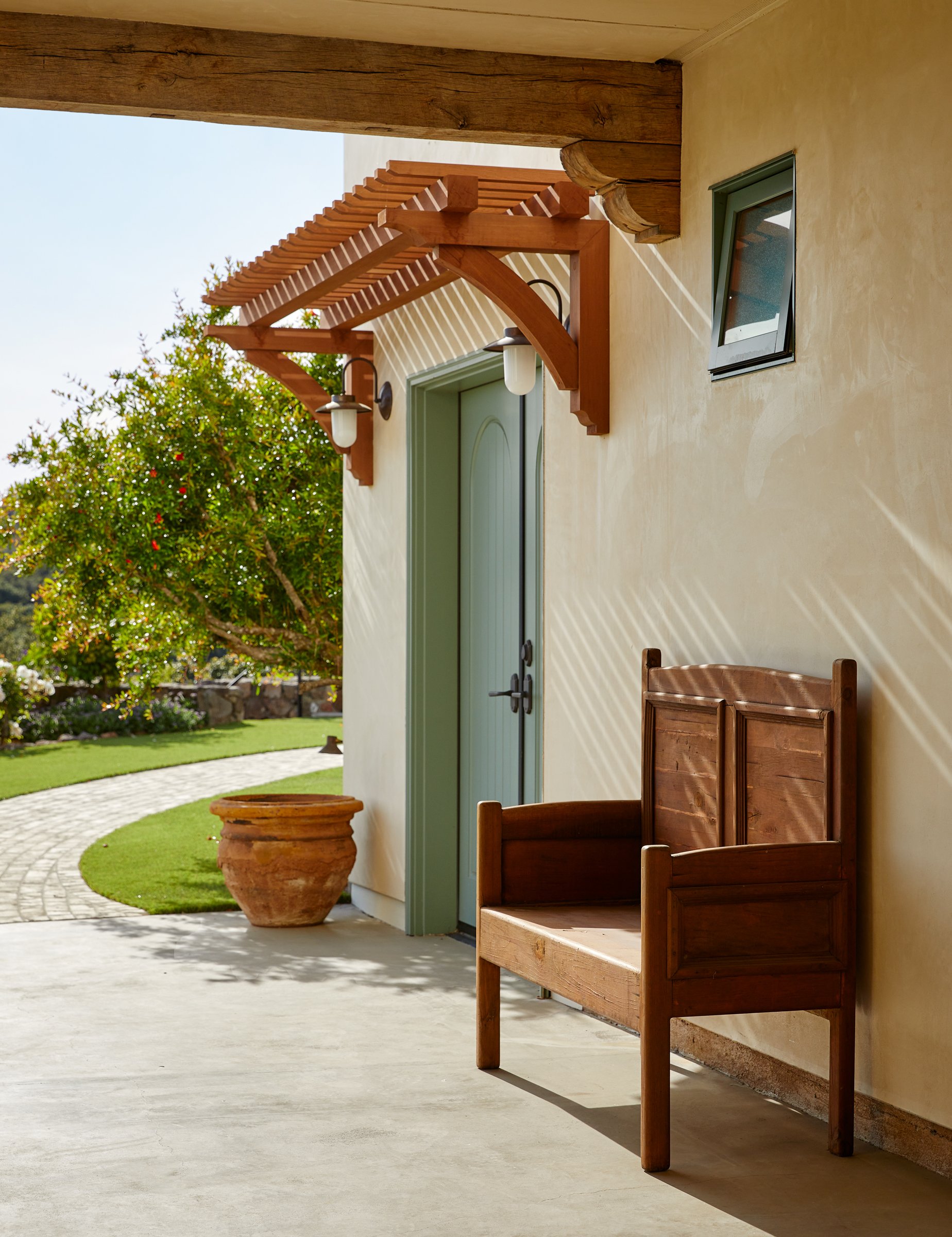
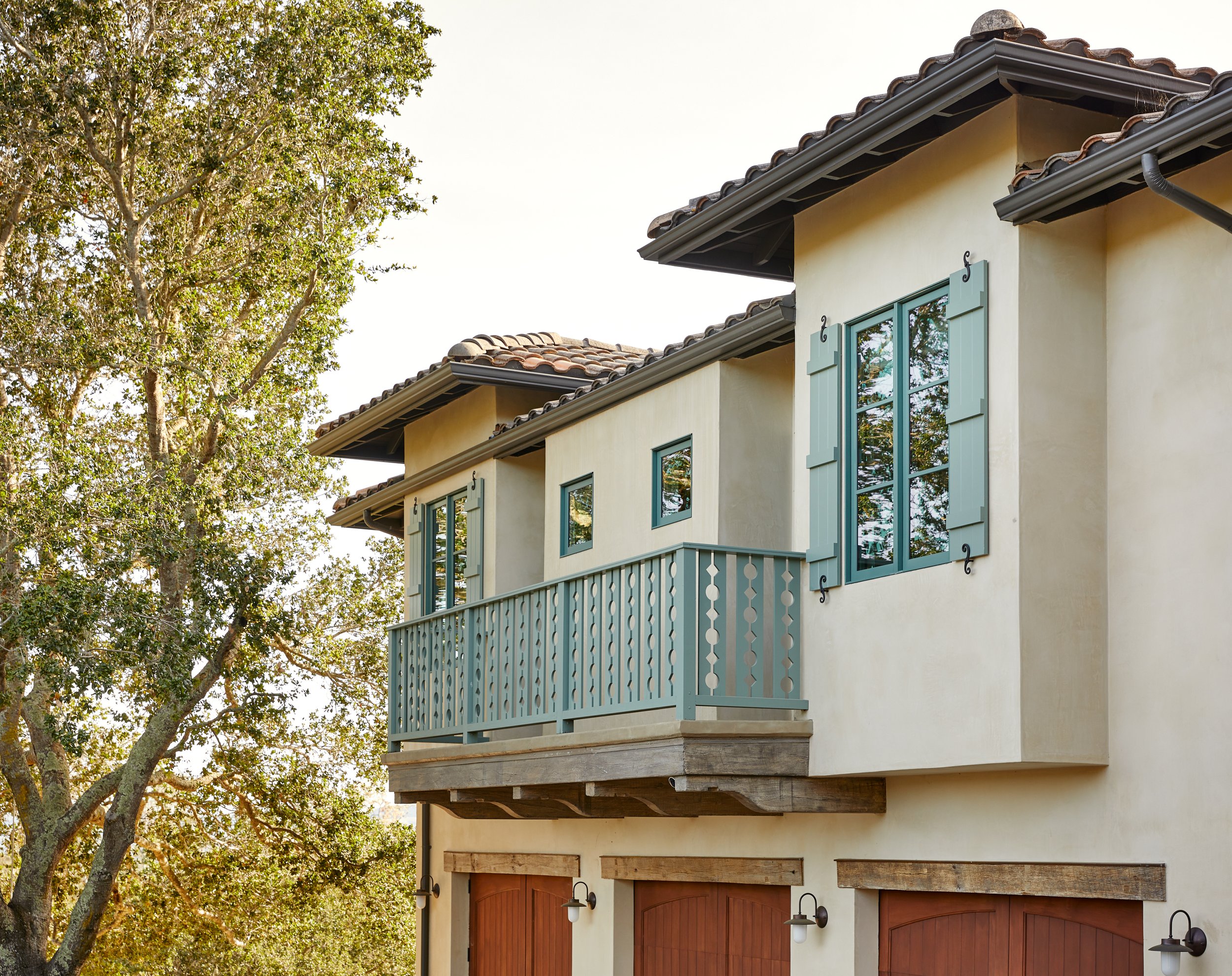
The exterior needed definition and ornamentation. We wanted to create harmony and alignments. At key openings we added reclaimed beams and corbels to reinforce their importance. At bedroom windows we added shutters with decorative hardware. Arguably one ofthe most unique features of the exterior is the green color chosen for the windows and railings. This color references classic Mission style architecture. Pattern play is a theme that occurs throughout the house and is exemplified in the the patter chosen for the railings and guardrails. This is a whimsical departure from more traditional ironwork than typically ordanes Spanish style houses.
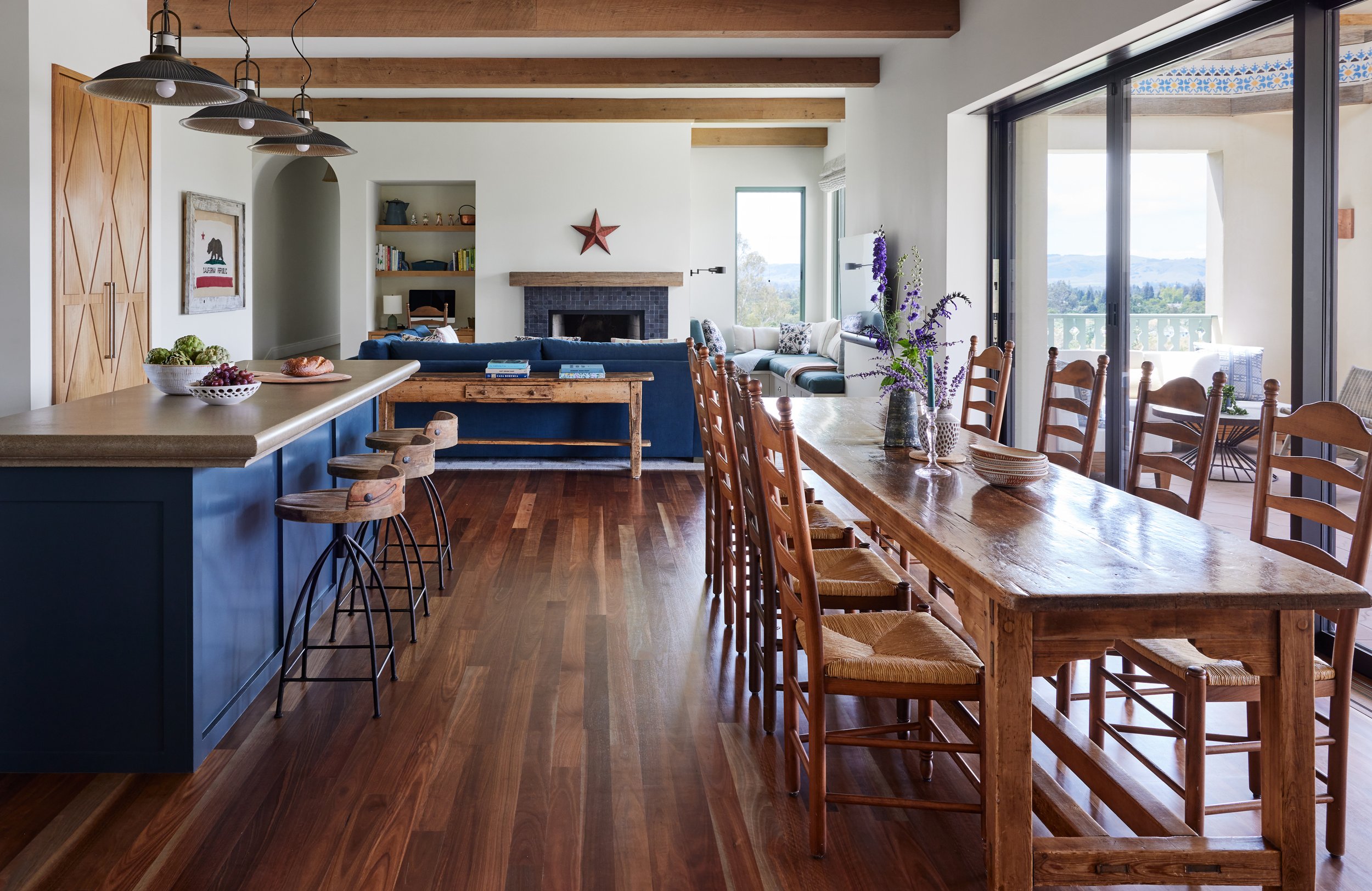
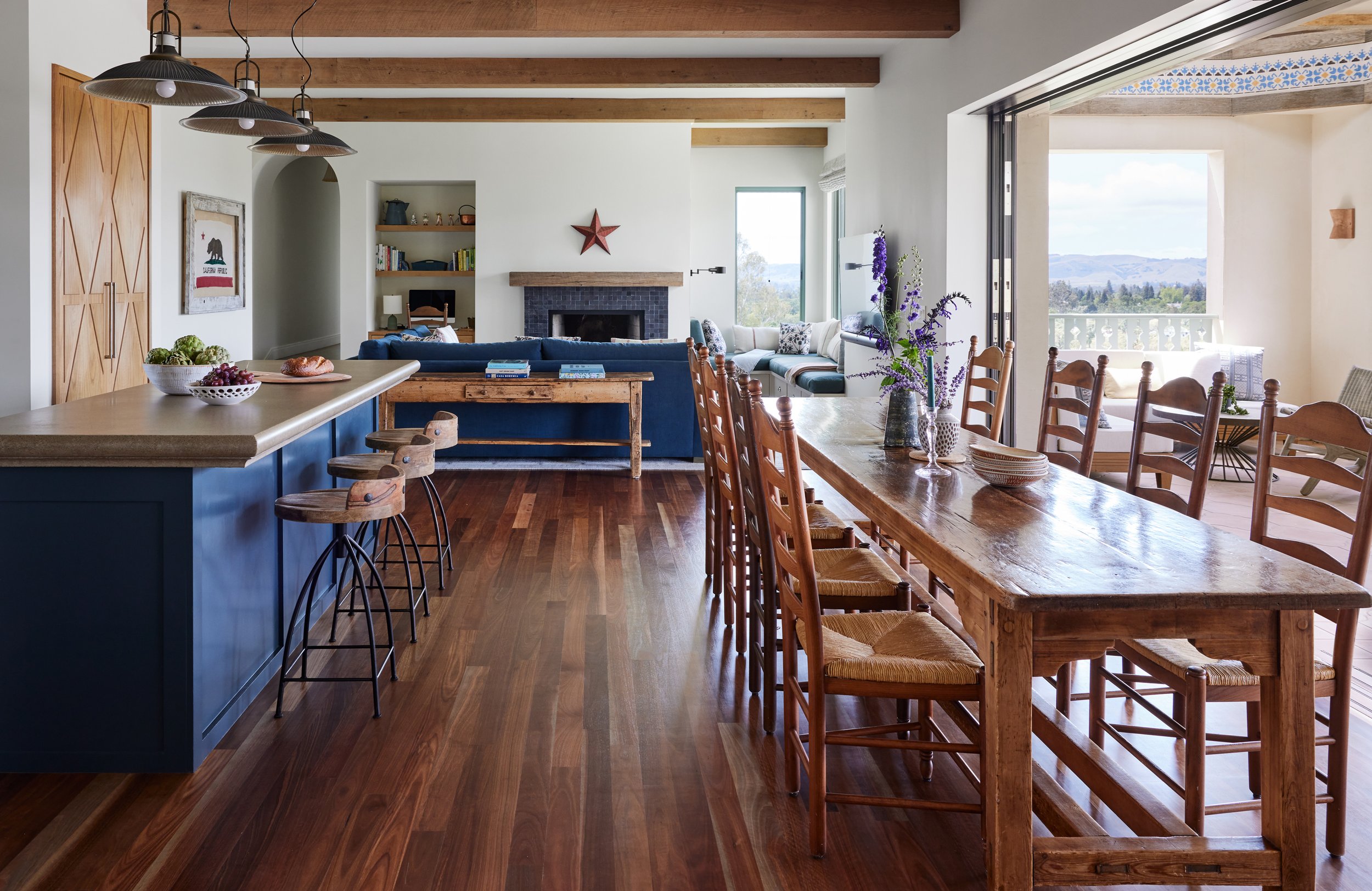
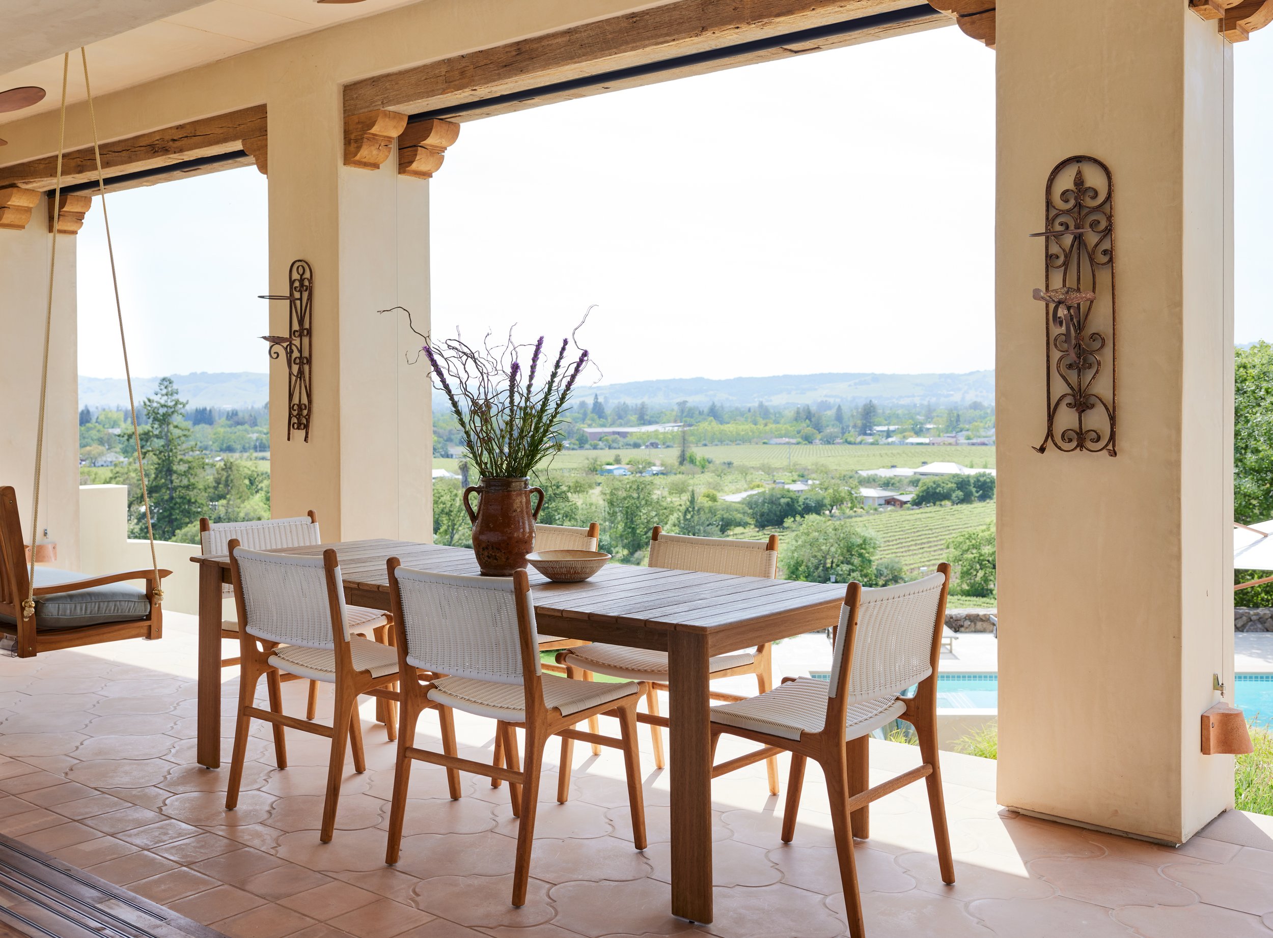
A major objective for this property was ensuring a seamless connection between indoor and outdoor living. In order to archive this we introduced two twenty-five foot openings in the living and dining room. The doors retract back into the wall opening up the house completely to the surrounding landscape. It burns the boundaries between indoors and outdoors and truly celebrates the best of Wine Country living.
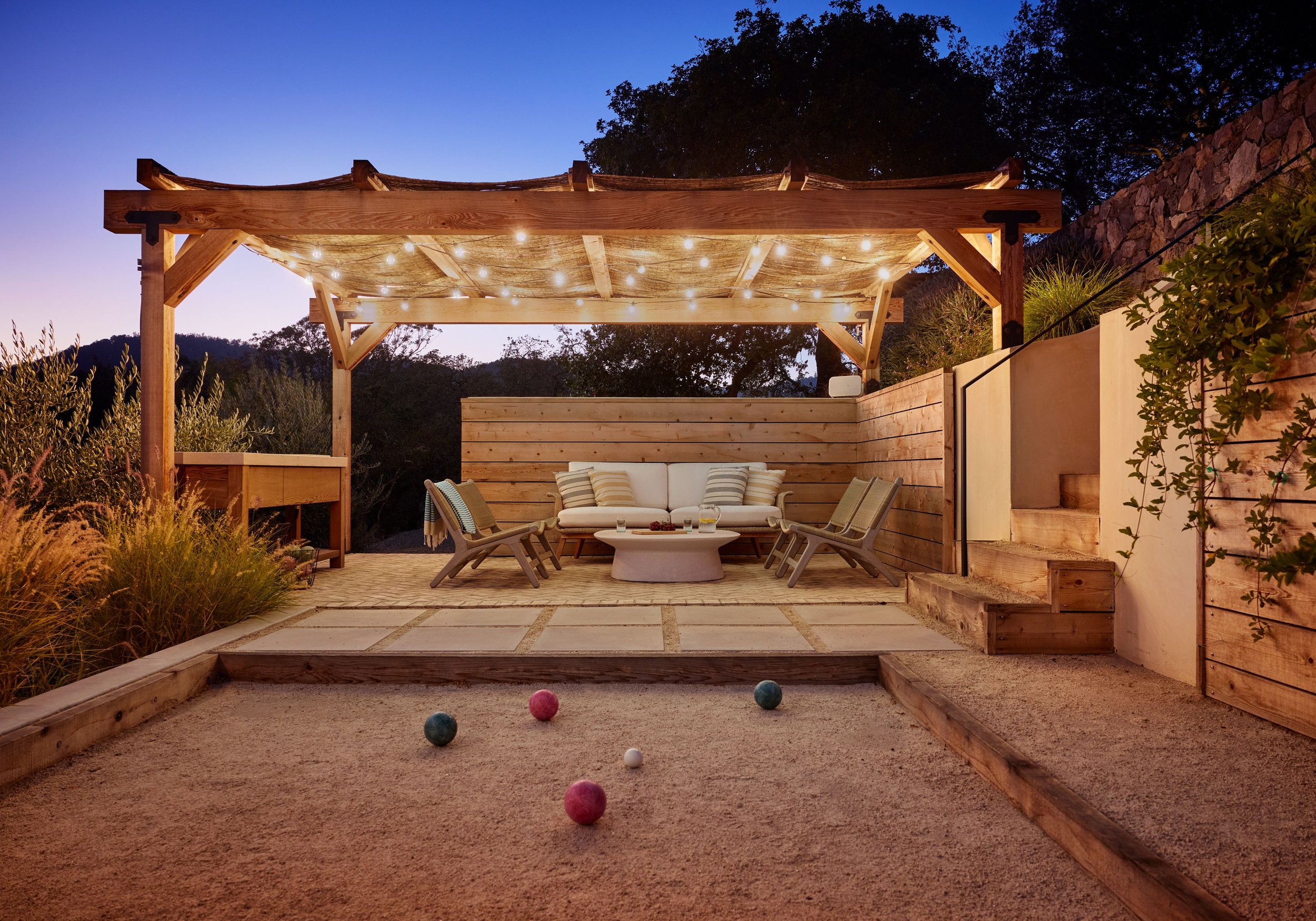
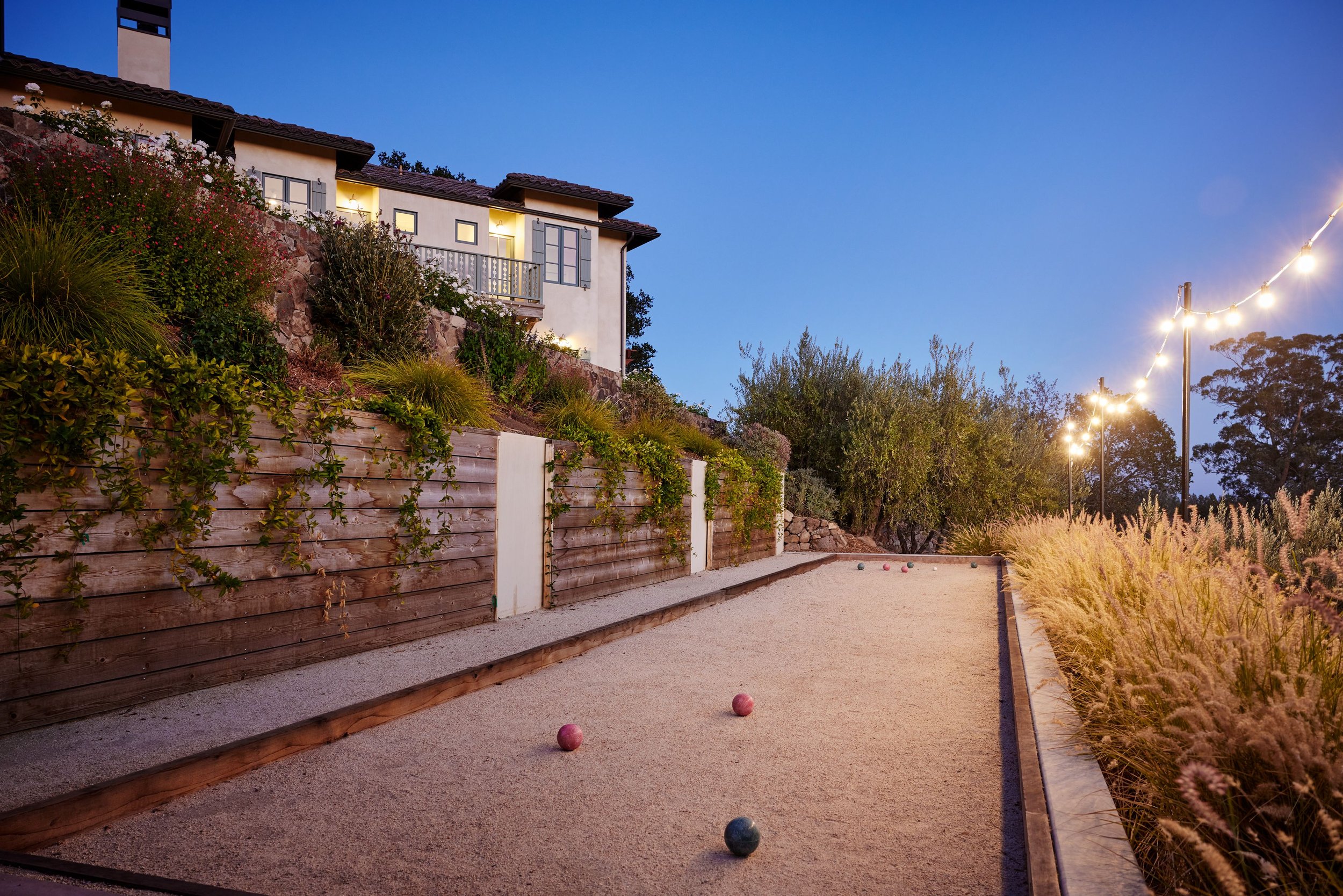
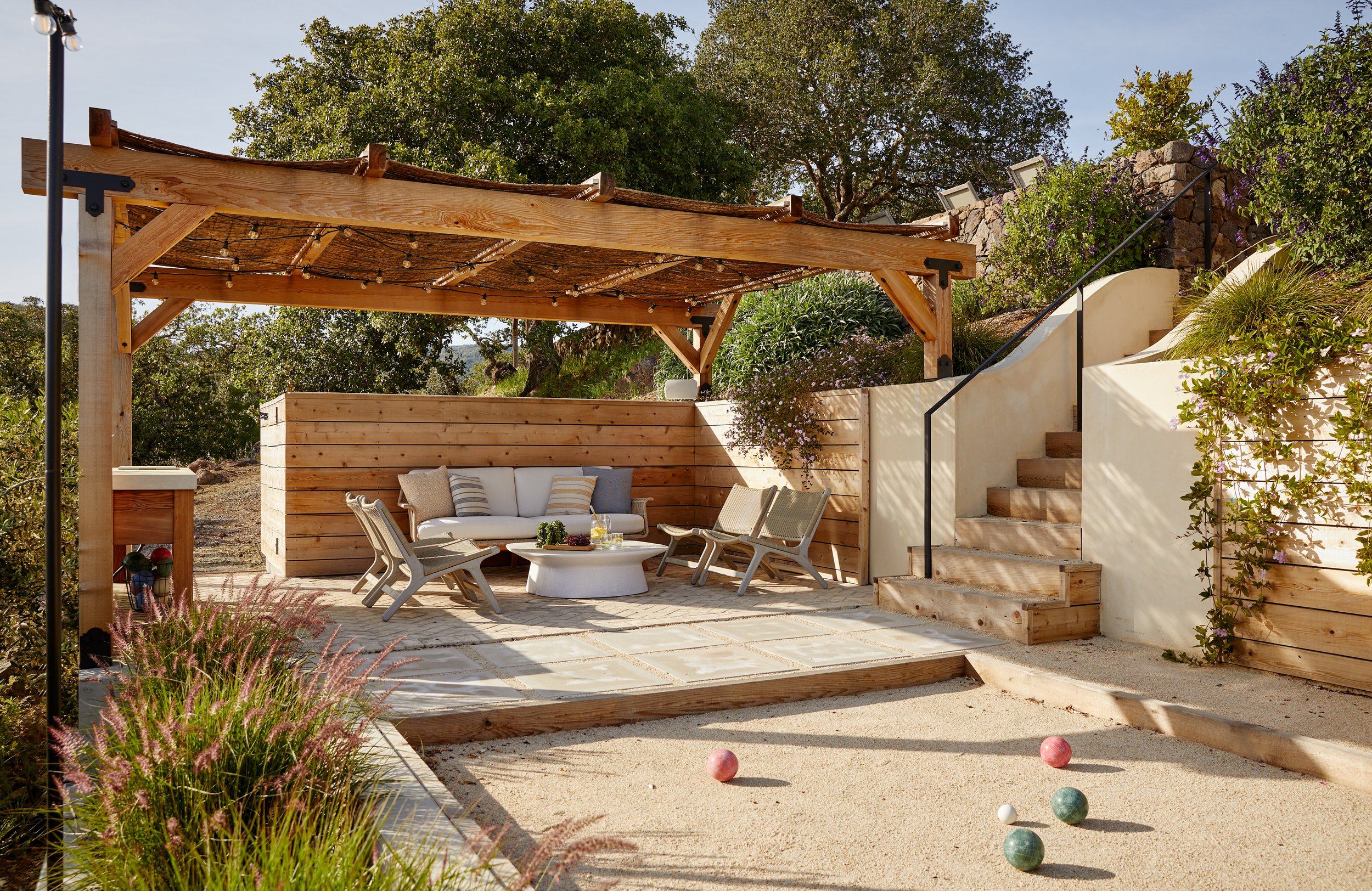
The bocce court took use of a lower part of the property that was directly connected to the property’s olive grove. We retained earth and carved out a court and living space for prime outdoor entertaining. We wanted to create an envirments that was intentionally casual and connected to its surroundings. Simple string lights set the tone and thatched roof of the pavilion echos a rustic charm. We broke up the large retaining wall with alternating panels of exposed concrete and wood slats where the landscape could cascade down to create softness.
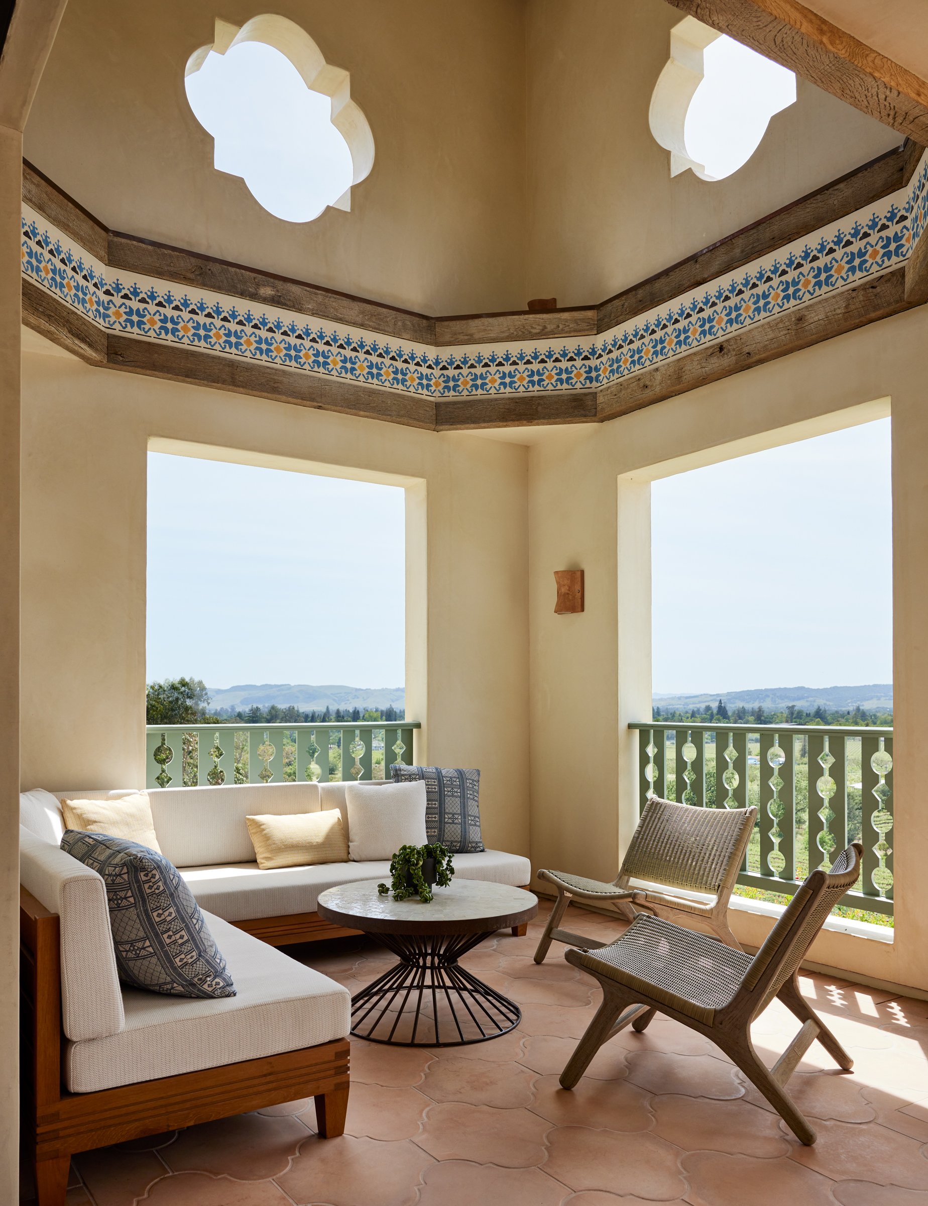
The rotunda as you may call it, space was one of the surprise bonus rooms that emerged as the project and design developed. The existing terrace off the house was narrow and somewhat tight to furnish. Previously there was a spiral stair that led up to the top of the tower but really to nowhere. It was hard to access and unusable. By removing the stair we opened up the tower volume to expose a dramatic two storey space. It freed up floor space for an outdoor living room. This has become a special place to lounge and soak up the views of the Sonoma Valley.
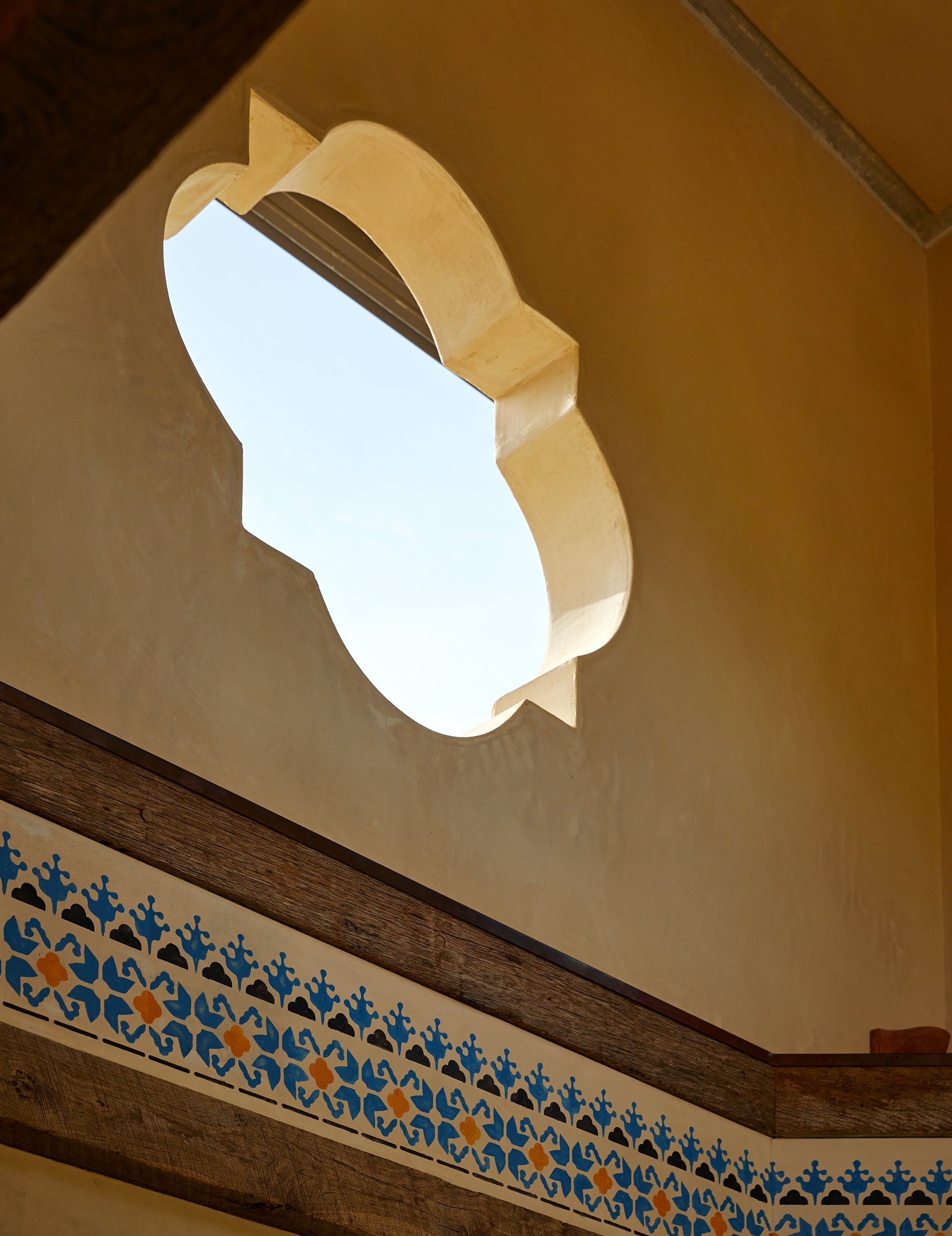
The rotunda exemplifies the aesthetic blend of Mediterranean and Mission Styles. We pierced the top of the tower with quatrefoils cutouts. . In order to introduce the scale to the space we created an architectural frieze - octagonally shaped and made of reclaimed wood beams. For the frieze itself, we coissoned artist Andrea Cosish tohand stencil a pattern, that is reminiscent of Byzantine and Moorish designs but in a more simplistic and playful way.
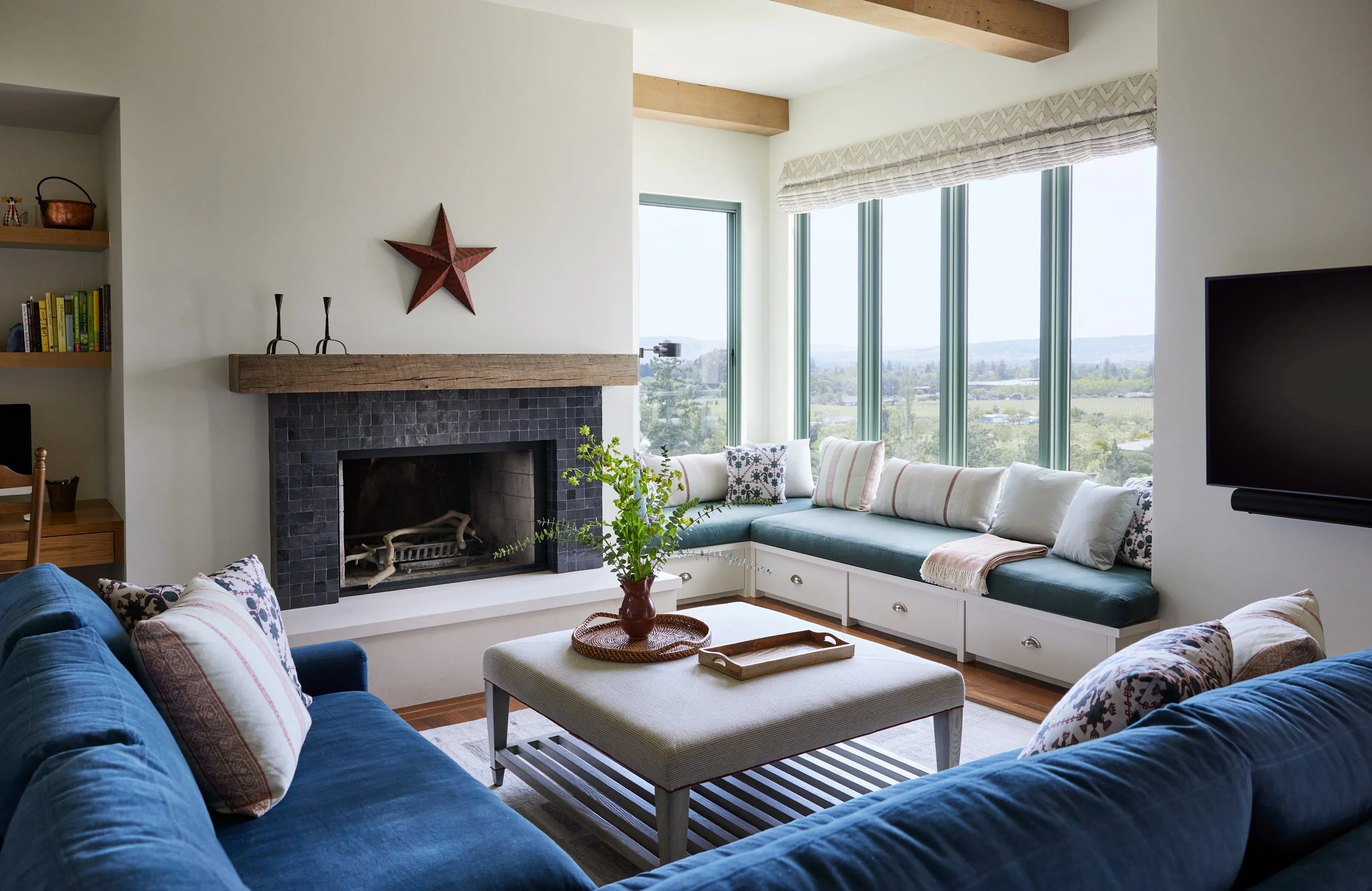
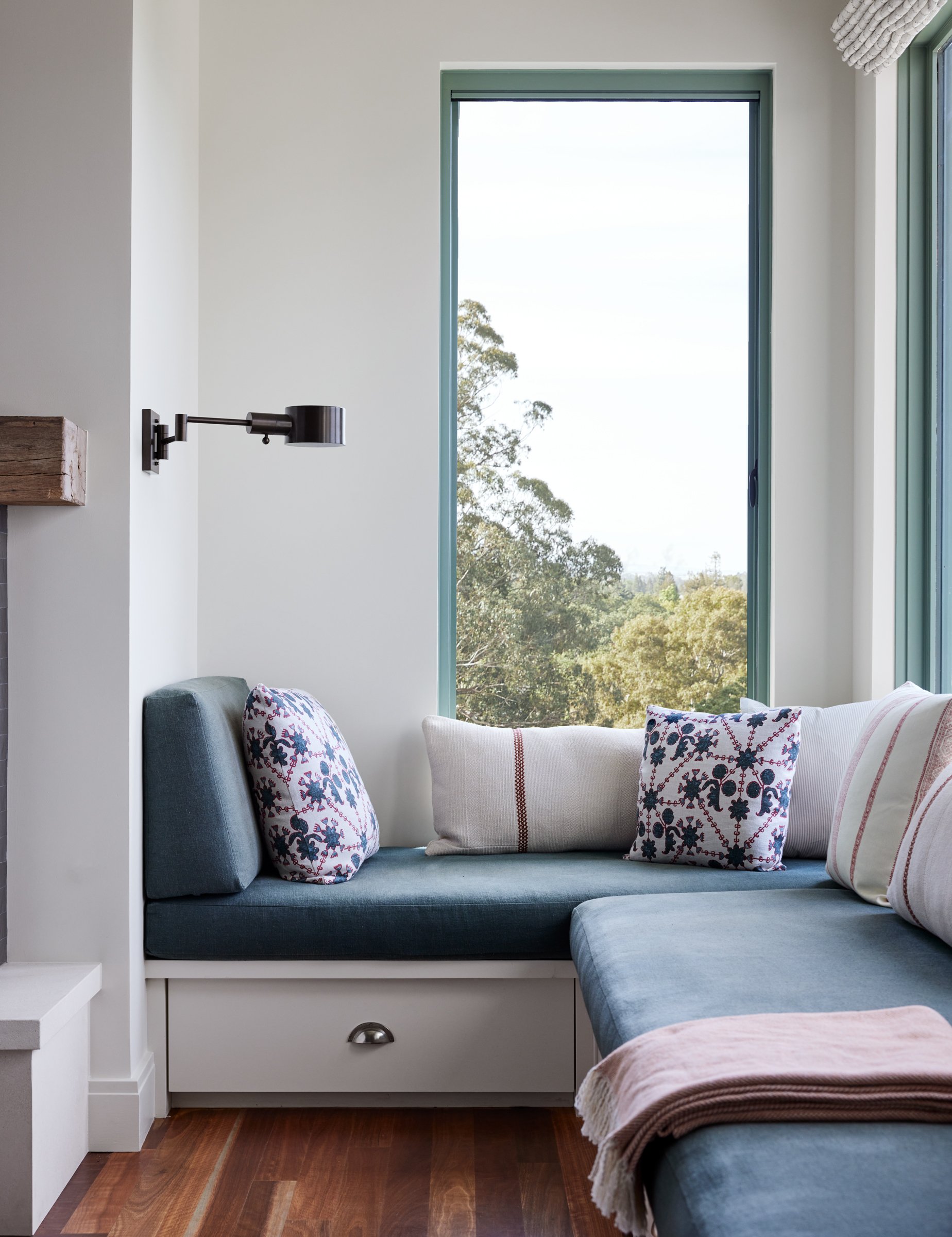
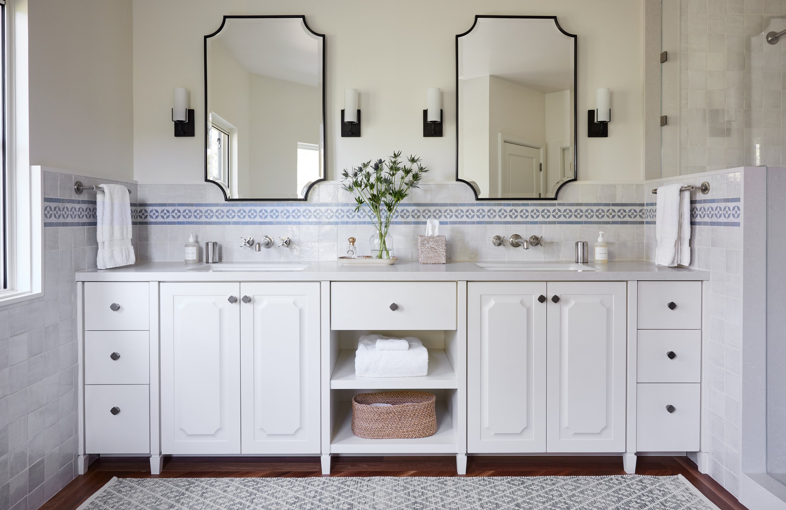
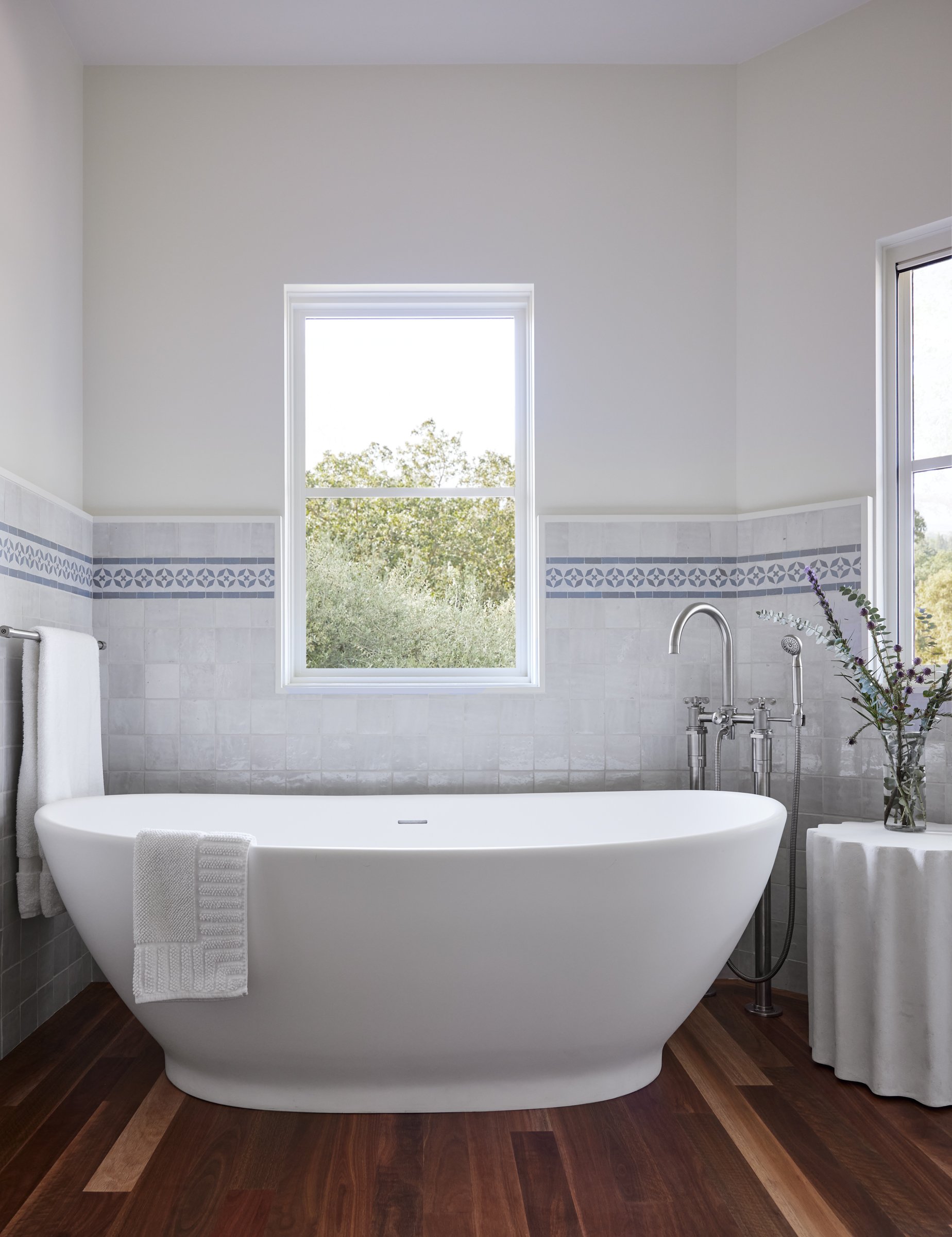
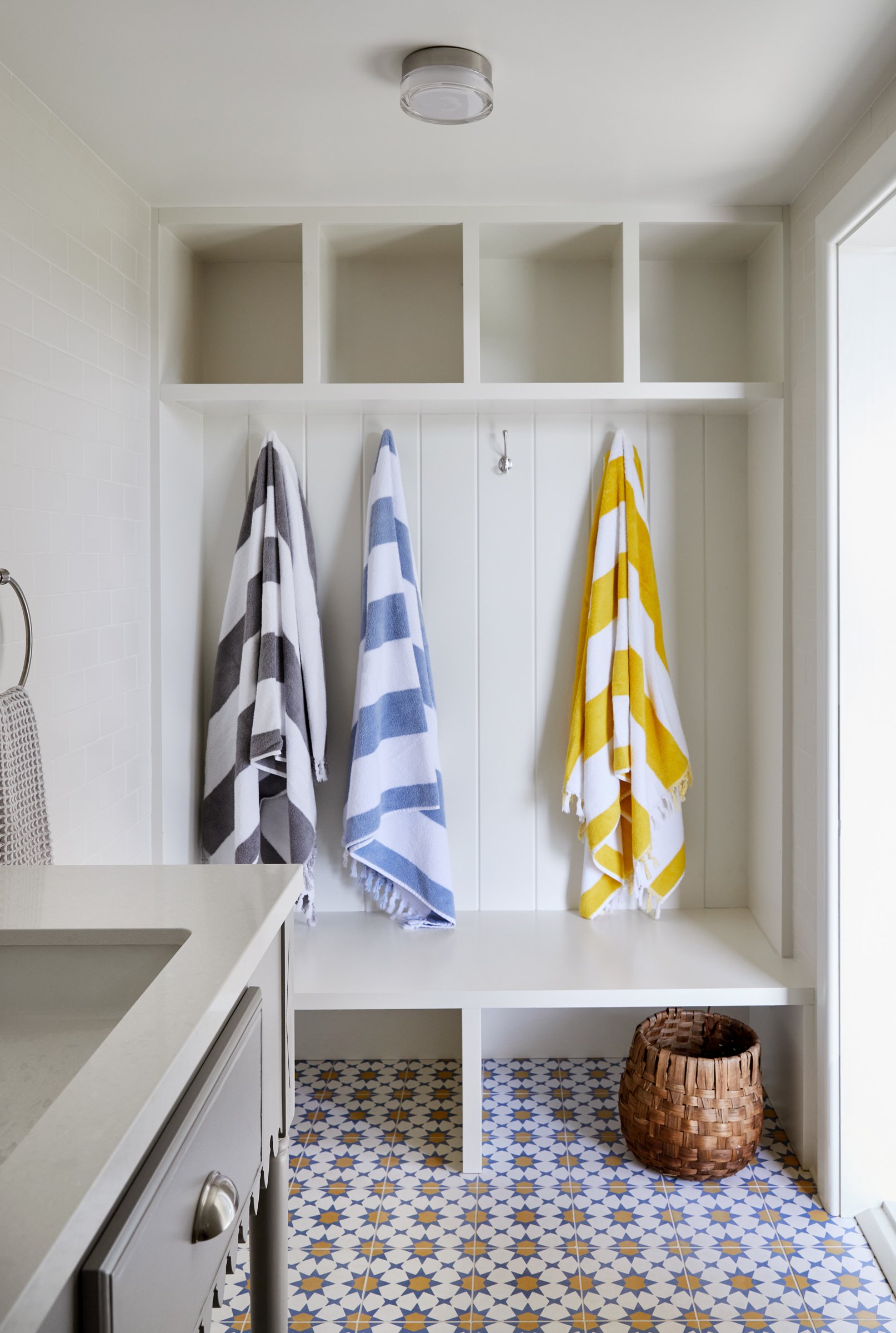
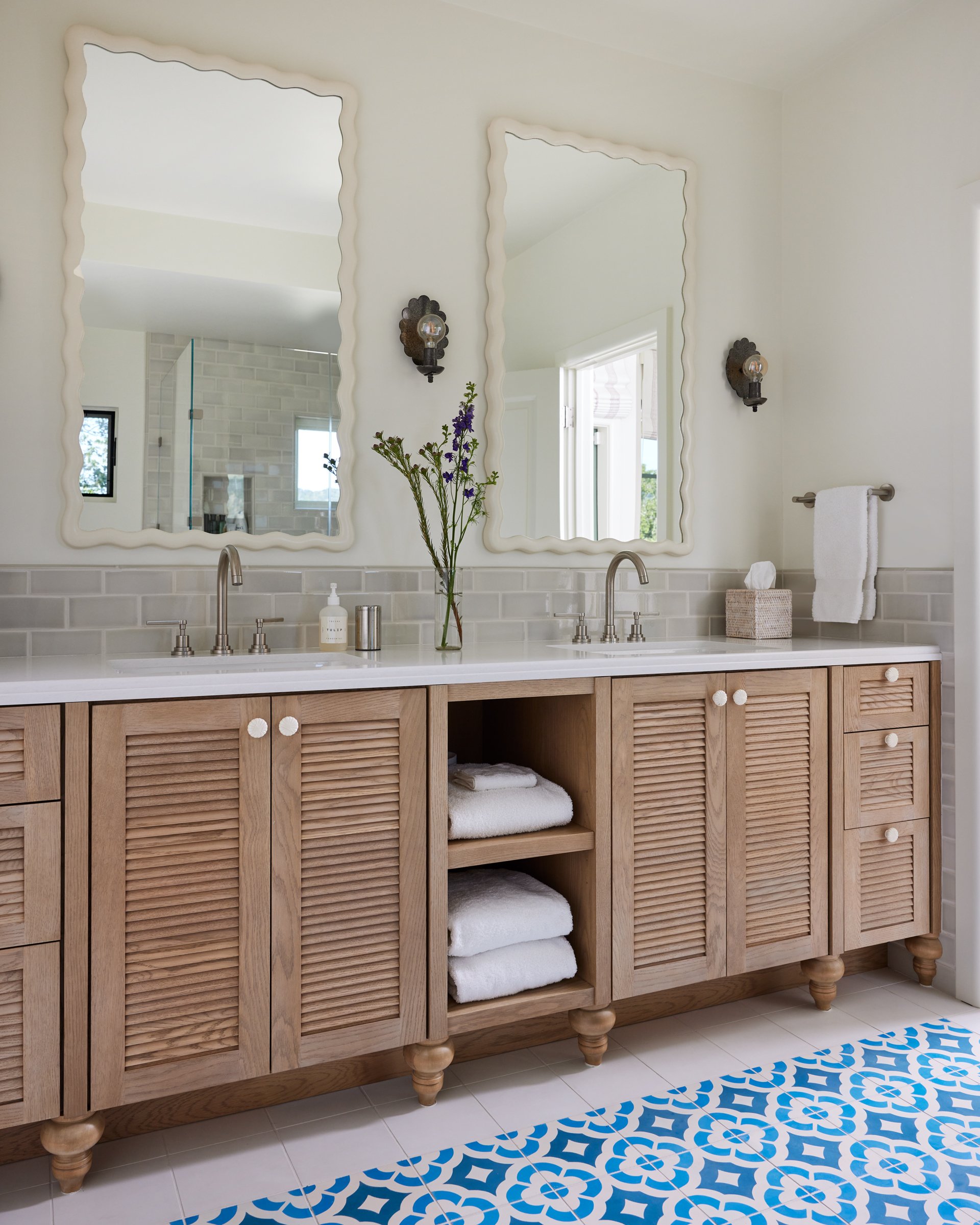
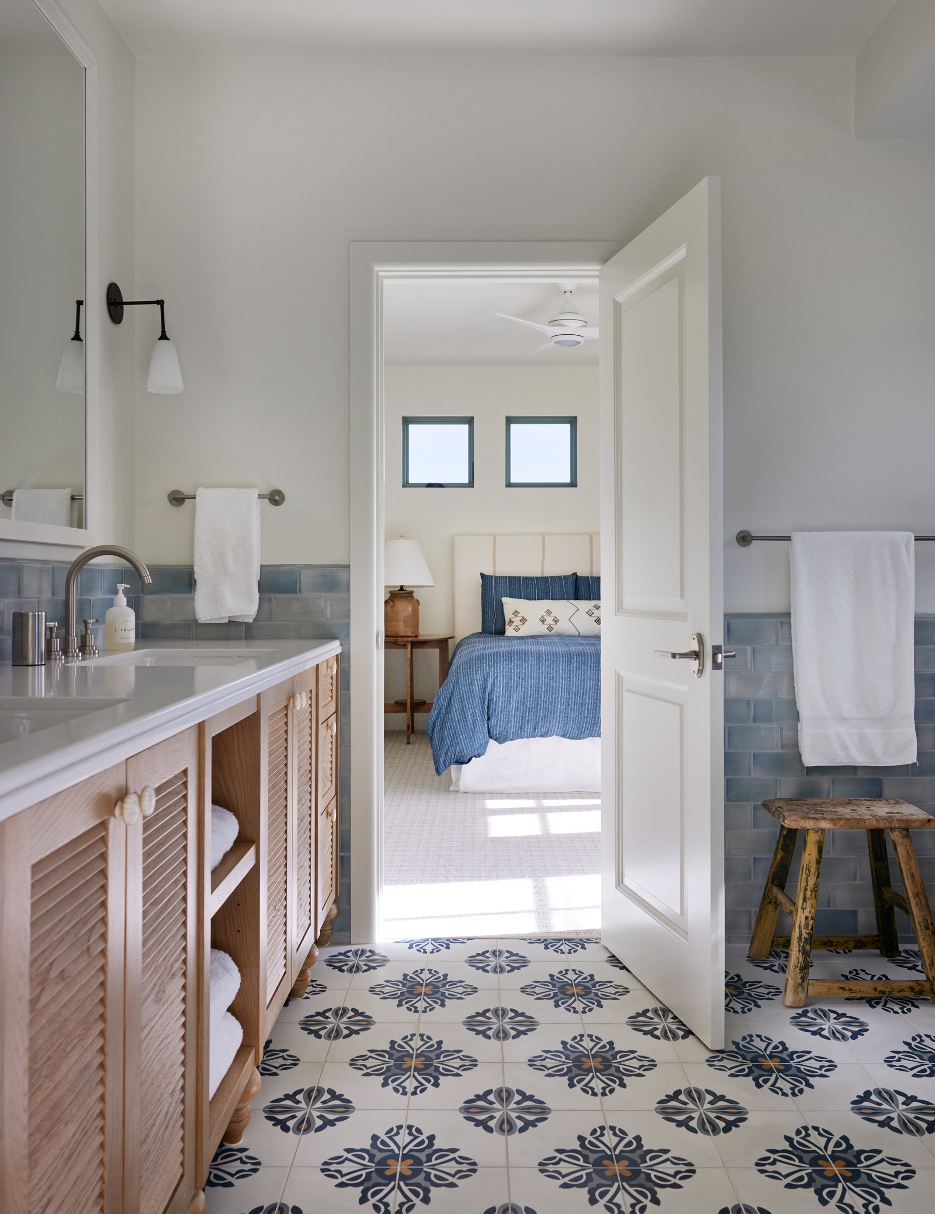
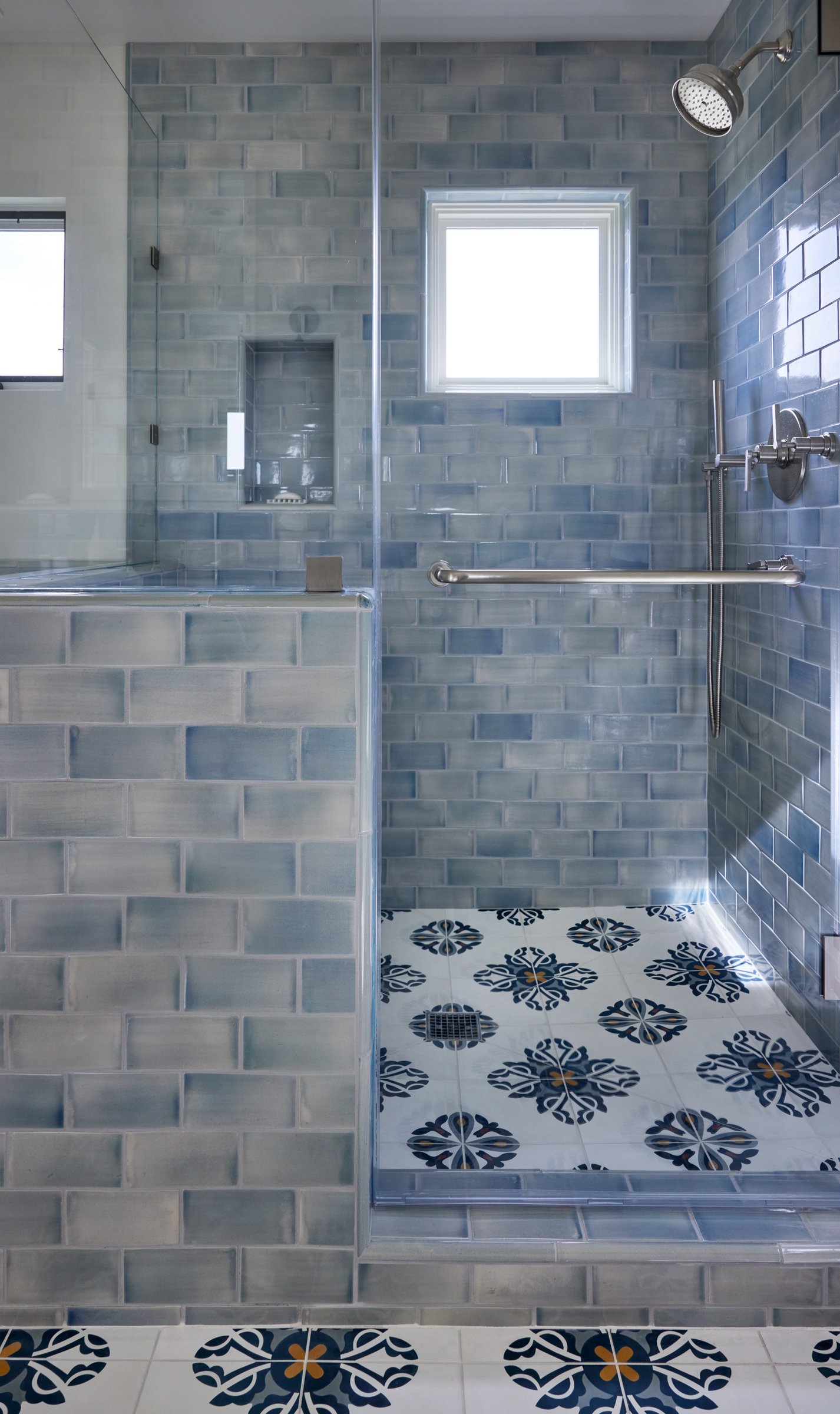
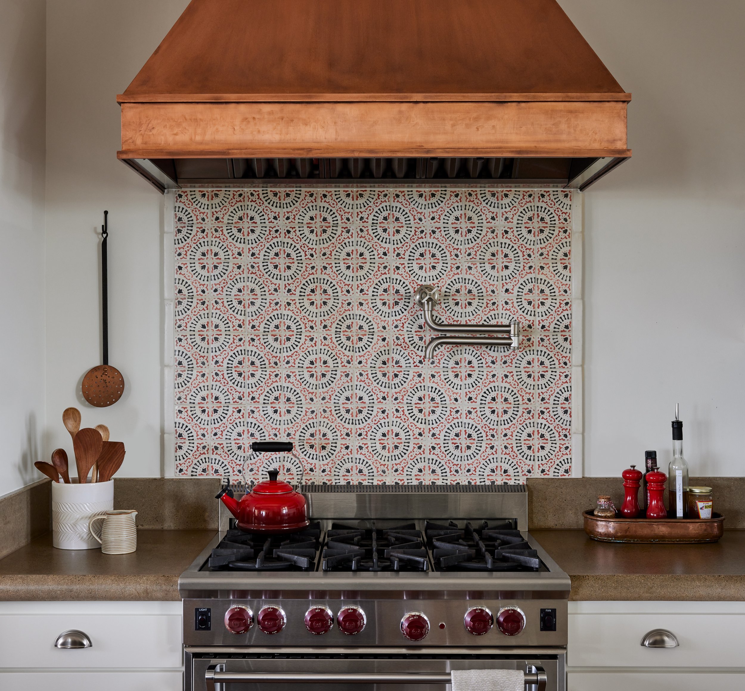
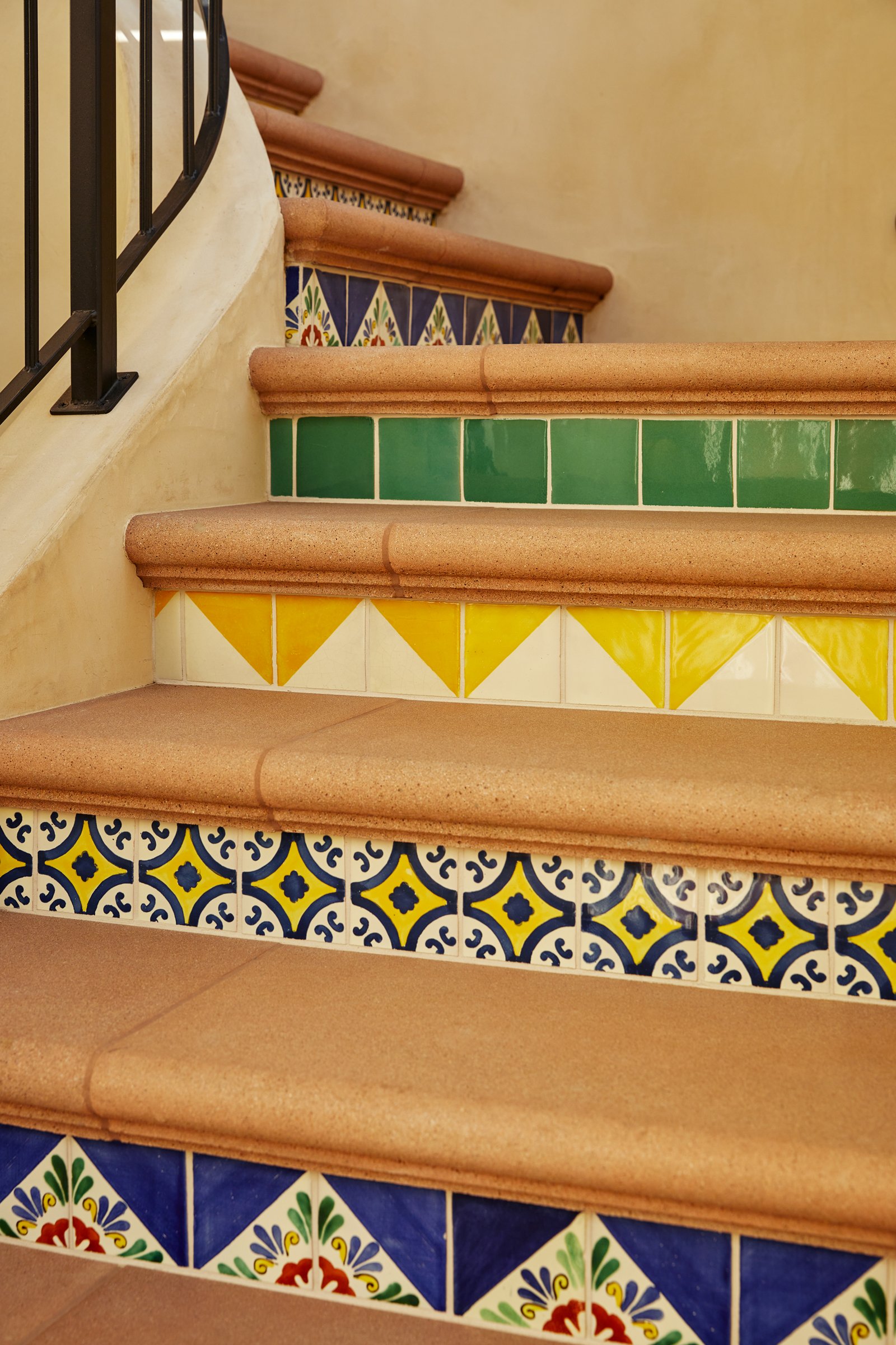
Pattern play is the name of the game throughout the tile in this house. The Clients were not afraid of color or pattern so long as the overall tone was light and cheerful . We scoured the market for tiles whose characteristics were reminiscent of Spanish and Moorish designs but in a more modern way. Blue tones are most prevalent in the selection that is also punctuated by accents of yellows, white and green. They’re is a playfulness between the bathrooms. Together the patterns create a story of their own as you move through the house.
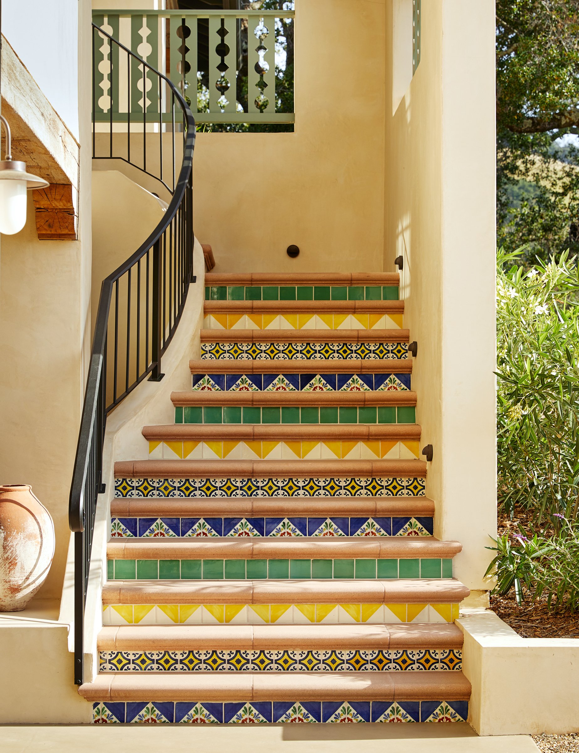
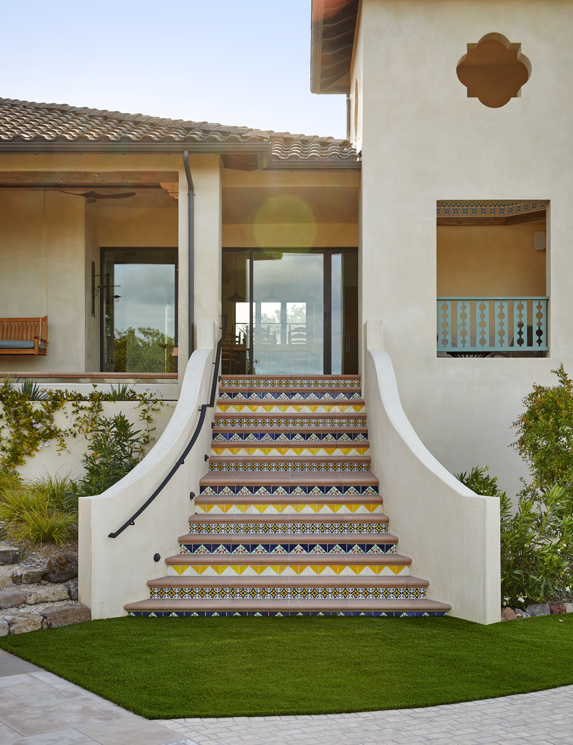
The main stair from the house to the pool was its own mini design challenge. The descent was going to be steep no matter what, but how to do so in a graceful way. We created a stucco staircase with terra cotta treads and tiled risers. The risers become the real design moment with alternating rows of colors and patterns. We must have mocked up 8 different scenarios before settling on the final selection.

