I love renovating vintage houses – even more fun when I too get to be the client!
This is a story about how my husband and I took an 1970’s Palm Springs house and turned it into our own modern desert oasis. This remodel also exemplifies design philosophies that drive my company - always referencing context, purpose, and place.
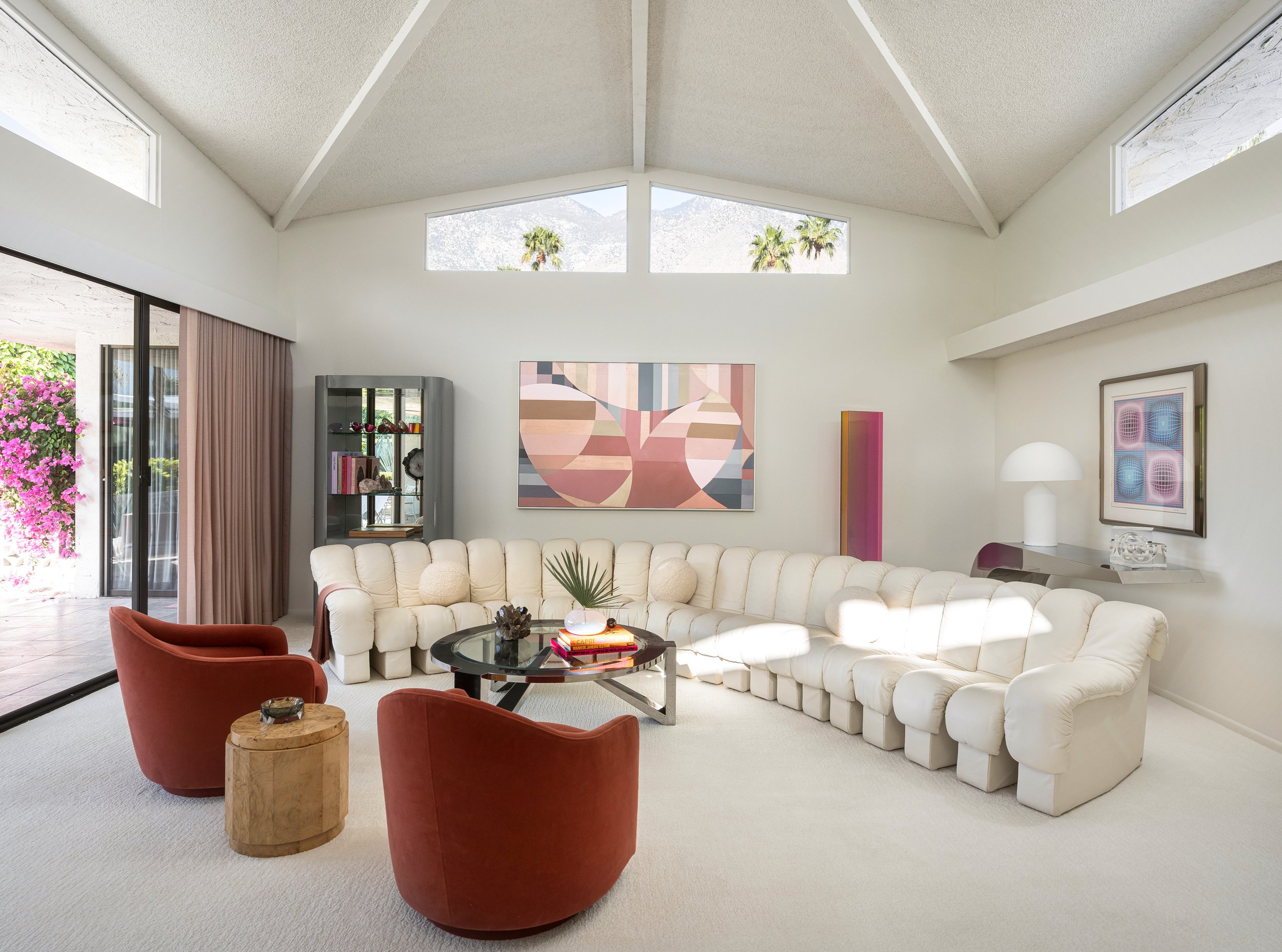
My love of the desert is long lived. Palm Springs has been a frequent getaway for me and my family throughout the years. When drawing inspiration for the design of our new home, it was easy to embrace different aspect I Iove about living in desert – From it mid-century roots, to the mountain vistas, the coloring of the sun kissed sky against the backdrop of desert landscape – all of this played a factor when selecting furnishings and fabrics. Of equal importance was also embracing the vintage era of the home and have that carry into the design without being too kitsch.
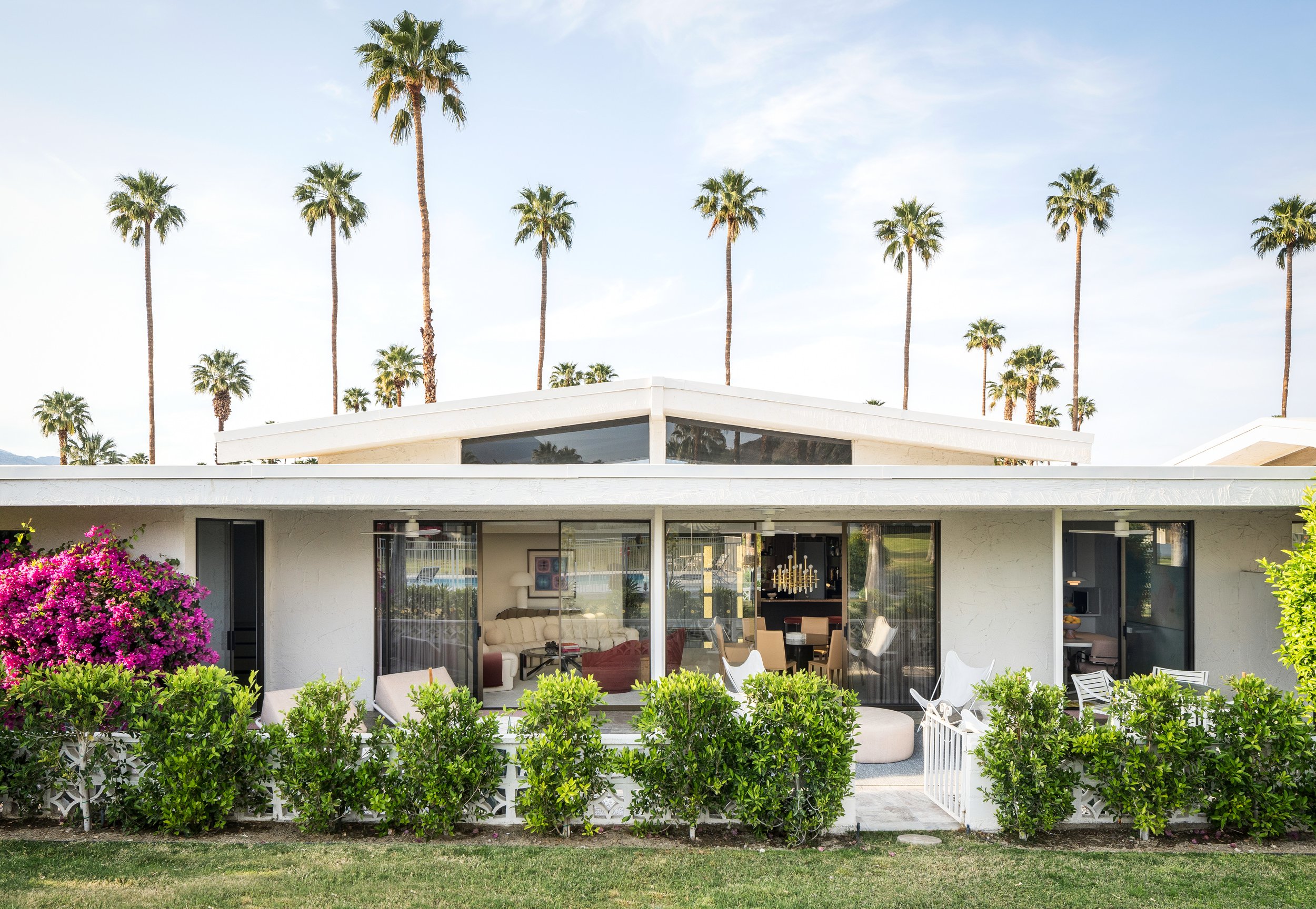

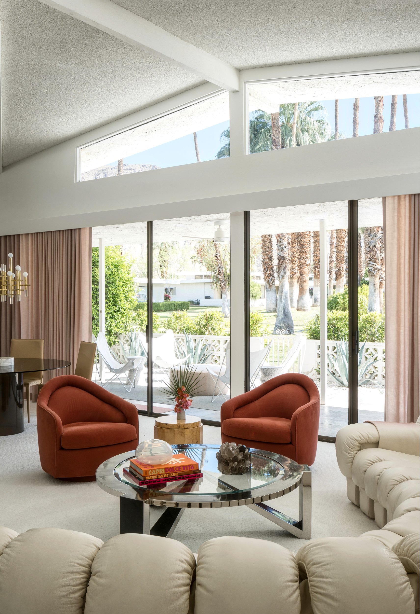
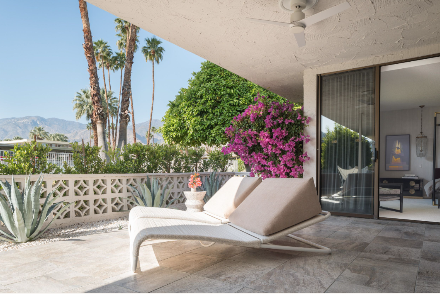
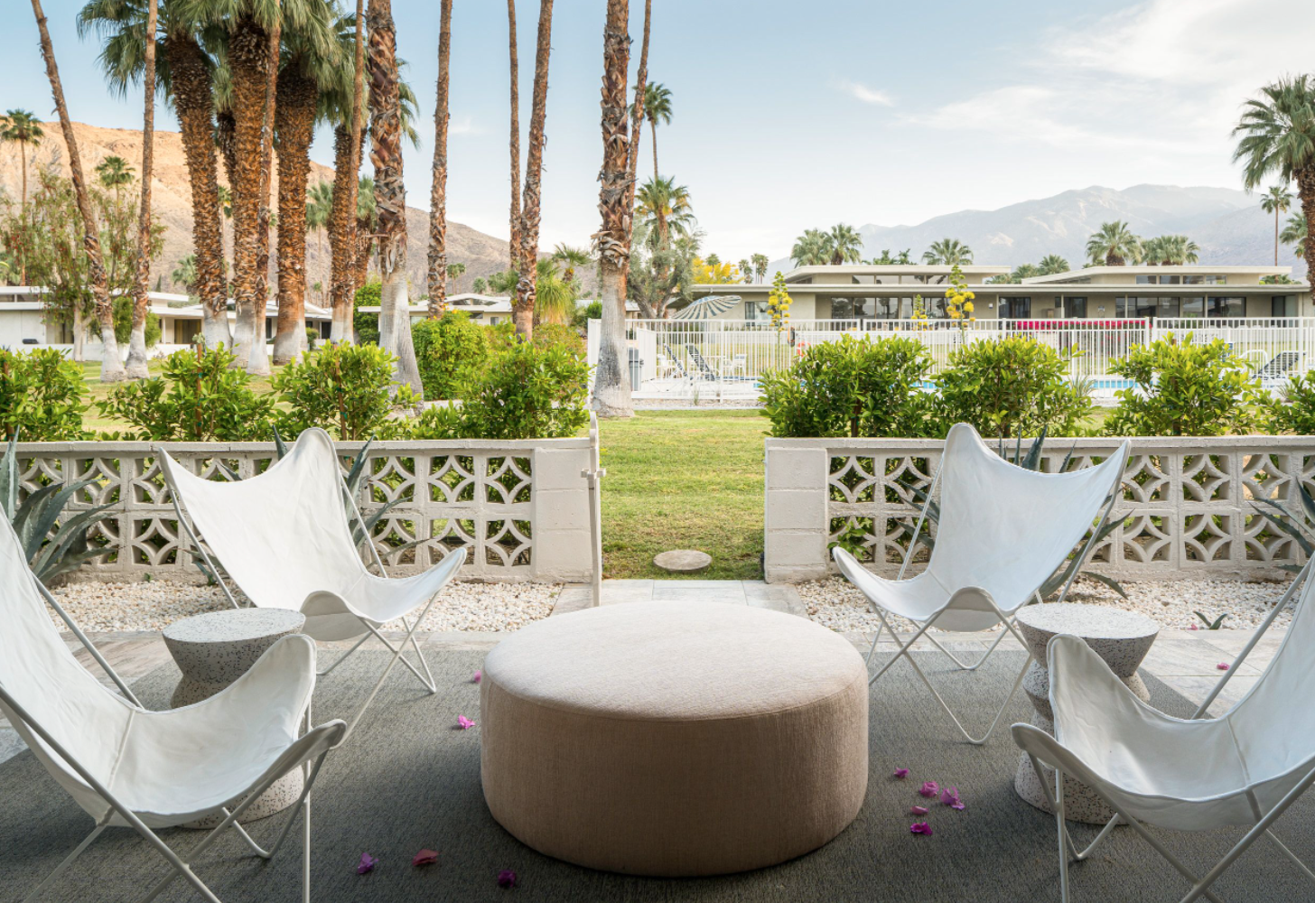
Flashback 2020 - aka the Great Migration - the pandemic sent many of us seeking new chapters and a change of scenery. Eric and I landed in Palm Springs during shelter in place; staying at a family house. It was then we decided it was time to plant our own roots in the desert. Our property search was narrow. Eric, in his realtor excellence, dialed in the neighborhood. I stressed wanting something with good vintage bones that we could refresh. Luckily, we came across a unit in Charles du Bois’ Canyon Estates development in South Palm Springs.
The unit was one of the original model units and had been in the same family since it was built in 1970. The floor plan was more-or less perfect. The vaulted roof of the great room with its clerestory windows amazingly provides views of the mountains and palm trees.
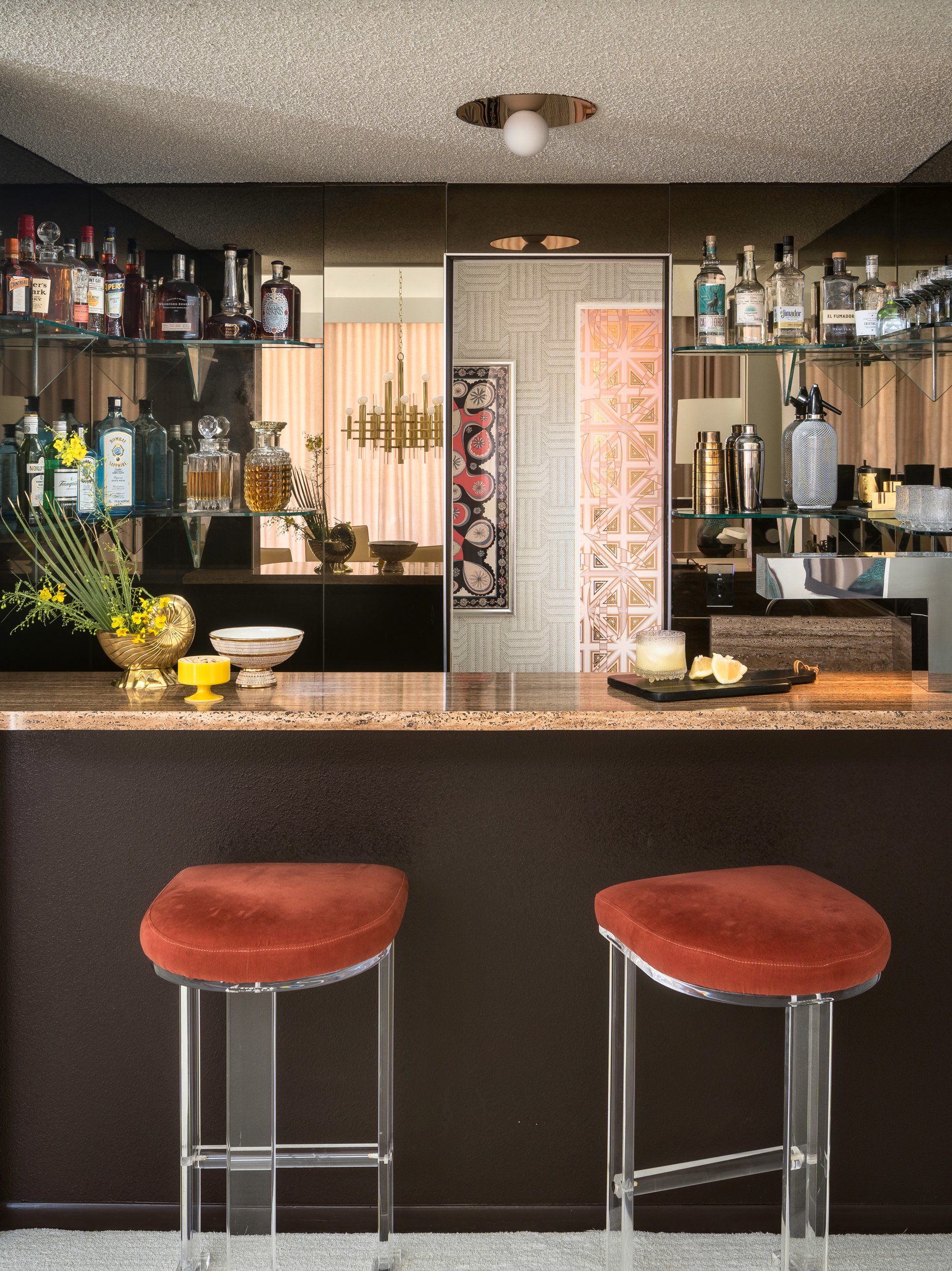
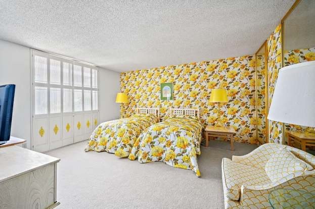
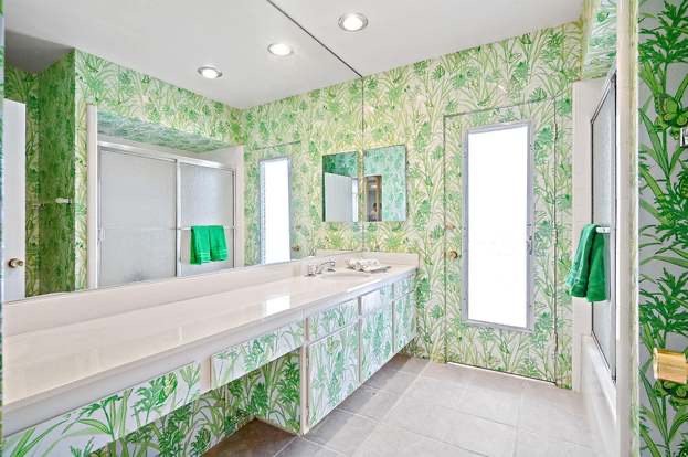
The original family worked with a designer and had more-or-less left it untouched all these years. It was something of a time capsule - walls of mirror, outlandish wallpaper, Formica counters - you name it. Certain attributes were cool, but the overall aesthetic was very Brady Bunch. The design challenge that emerged was test in how to keep the right vintage elements but update the house in a meaningful way to reflect our own personalities and tastes.
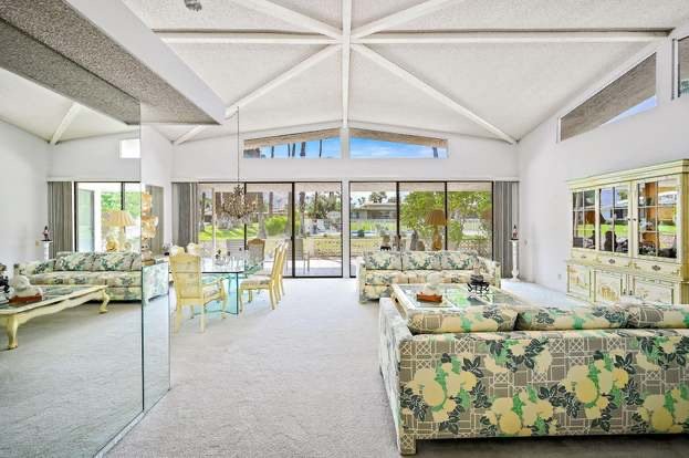
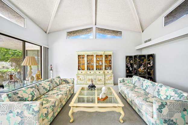
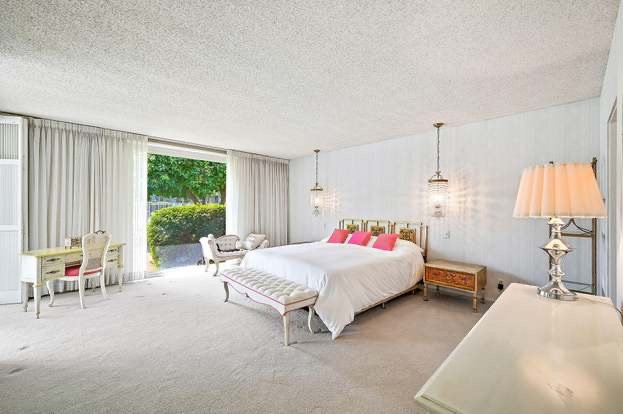
When it came time to source fixtures and furniture, the global supply-chains were already in turmoil. Lucky for us - ‘the hunt’ for the perfect vintage furniture is something of a passion and there is arguably no better place to scour shops than in Palm Springs. From Misty’s, to Christopher Anthony, Flow Modern or Modernway - there are myriad shops that continuously rotate through amazing vintage furniture.
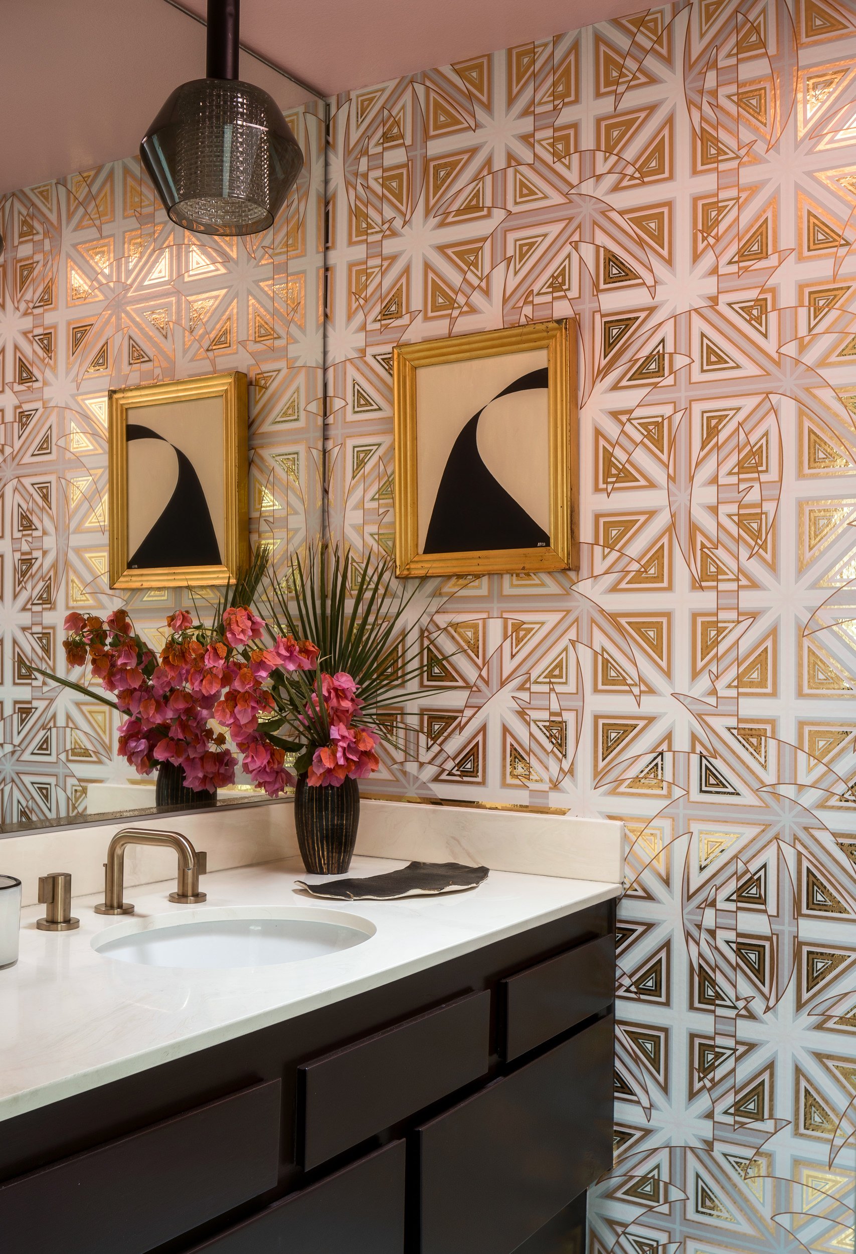
Although Marsha Brady’s daisies had to go - we did want to respect the flavor of the times with some unconventional wallpaper. For this we turned to local Palm Springs designer Don Flood of FliePaper, sold locally through De Sousa Hughes. This includes the peacock feathers for the guest bath and life size flamingos for the primary bath. We also worked with Flavor Paper for the glammed up foil paper that lines the powder room.
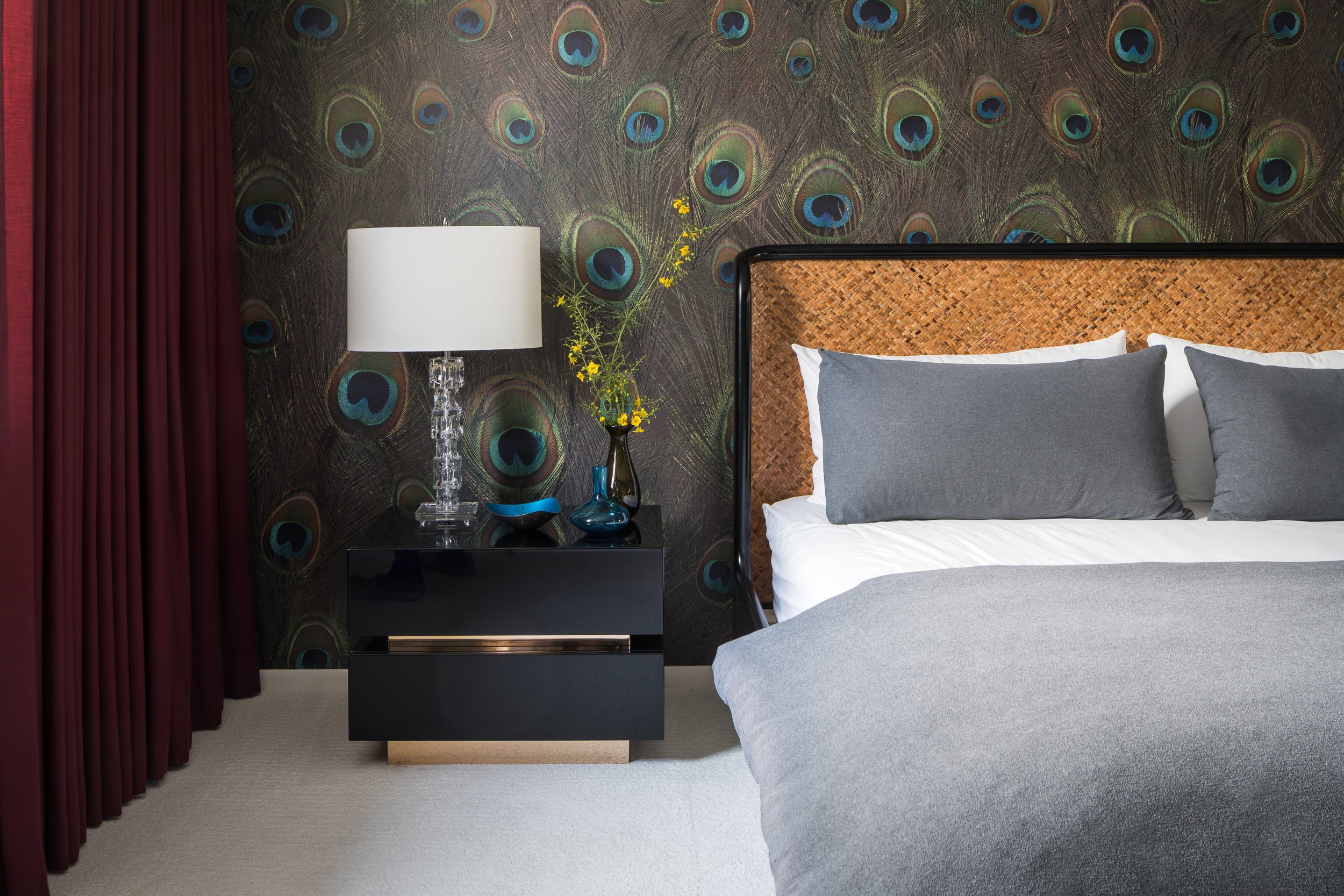
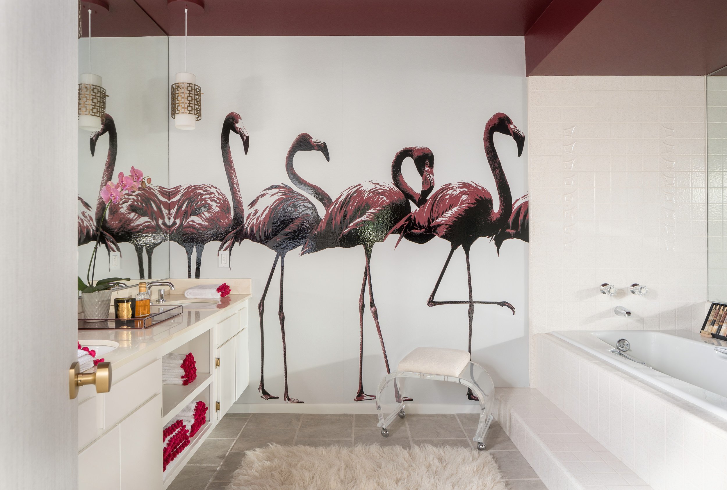
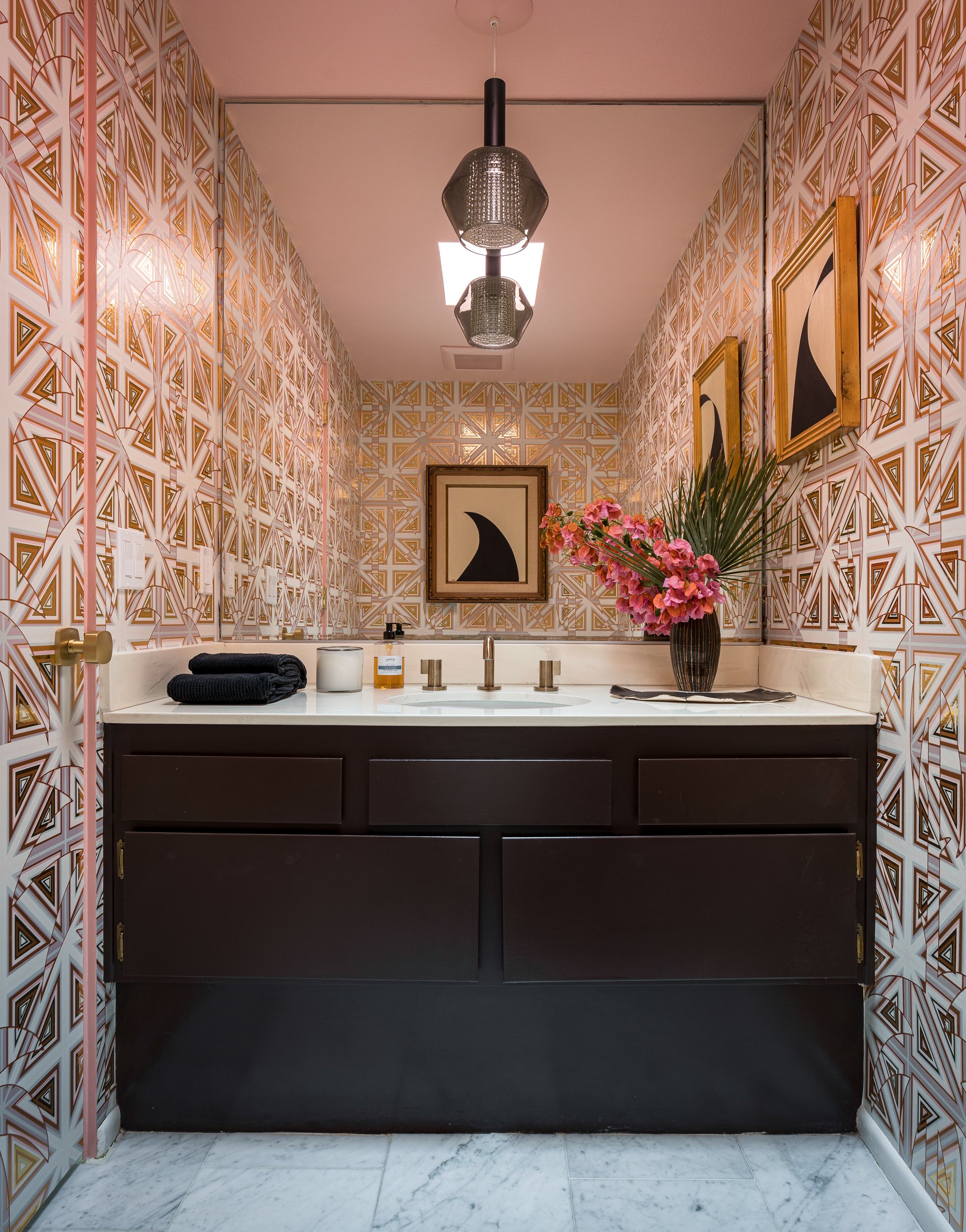

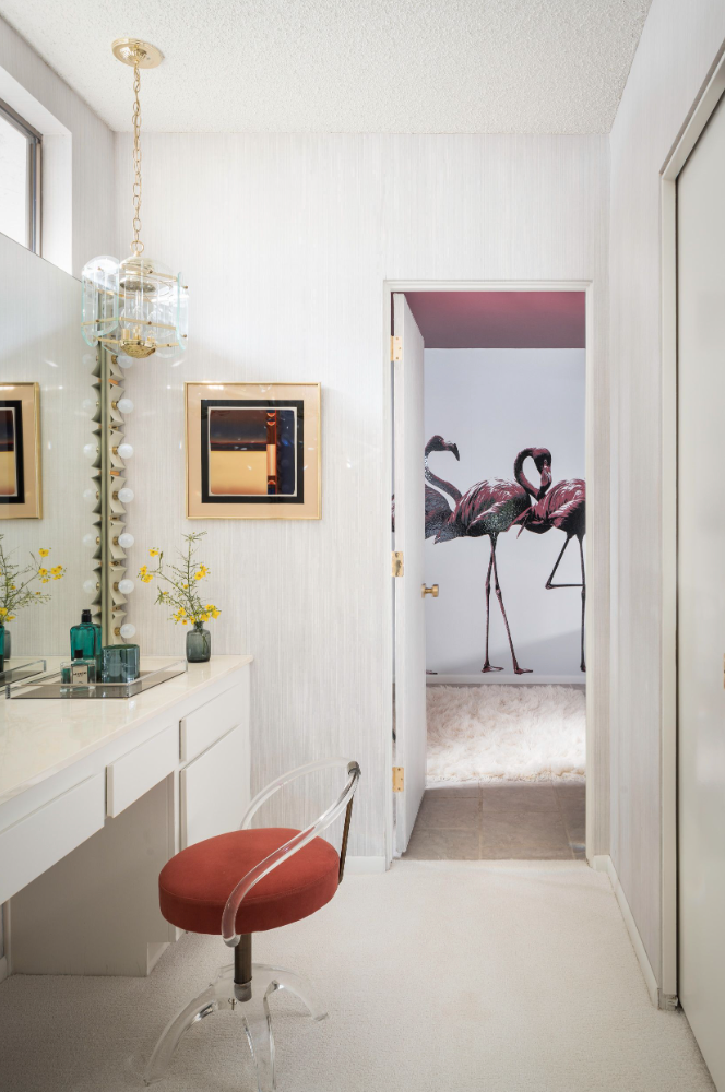
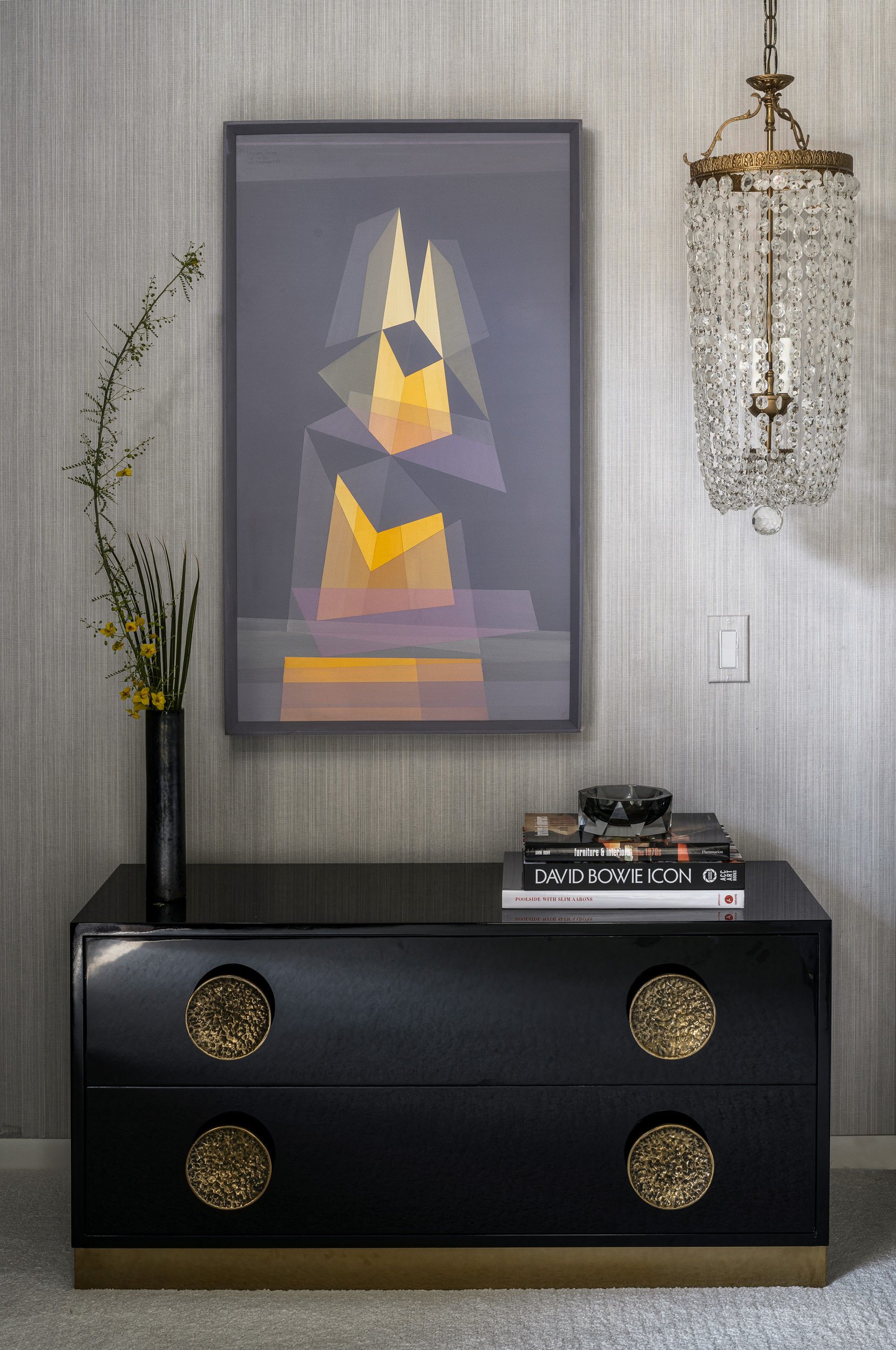
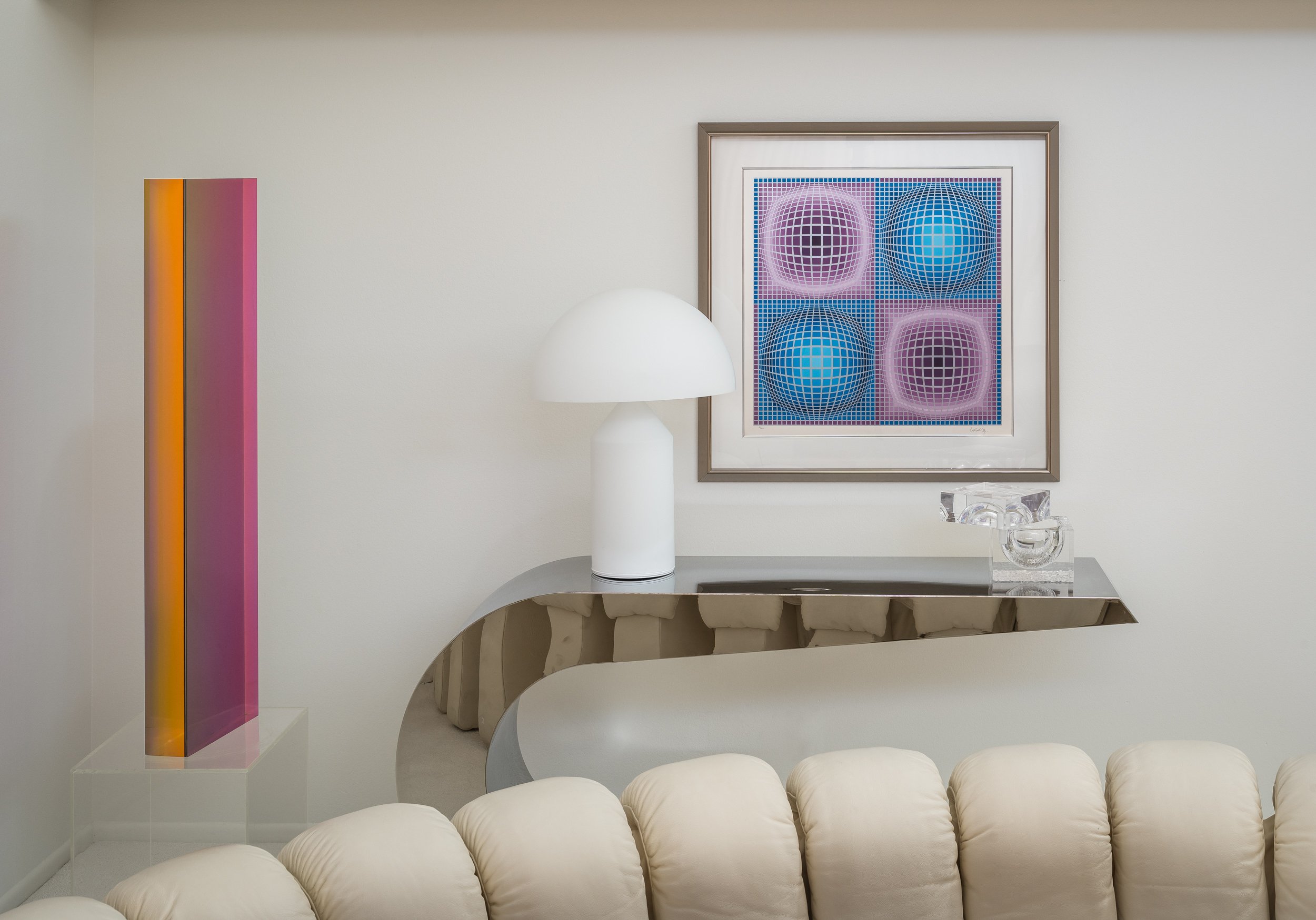
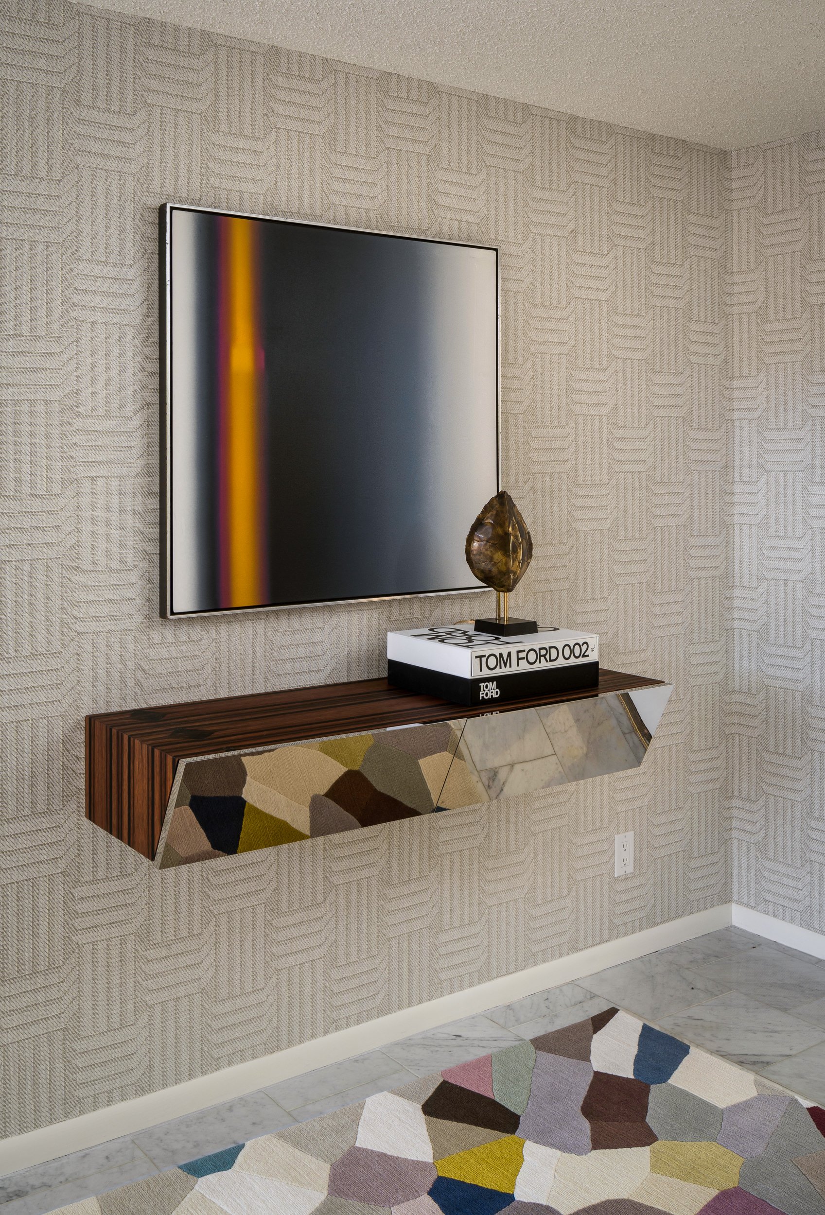
Sourcing artwork for this house was super fun. We really wanted to embrace the bold geometrics and patterns that were popular in the 70’s - again without being too kitsch. Our vintage finds turned up some original artwork from the era including paintings by Eugen Dana, prints by Victor Vasarely and an incredible acrylic sculpture by Vasa. These pieces are accompanied by more contemporary works of living artists are carrying on a similar tradition of color studies and geometric explorations. This can be seen in the large painting by Edward Granger and Daniel Hukill.

Reimagining a space that was built and designed for a different era is a bit like a puzzle that takes a balance of respect for the past and appreciation of the comforts of the present. It was a lot of fun breathing new life into this space and even better we get to call it home!
