Interior Design - BK Interior Design / Architect - Martha Bute / Contractor - Marcellus Barone, The Southampton Group
Step inside our latest residential project in Houston, Texas, where we were tasked with transforming a traditional-style family home. Our clients, who have lived in the house for the past 20 years, were ready to breathe new light into their home. Our team reimagined the interior into a bright and welcoming space that would stand the test of time. We paired classic architectural details with vintage elements and statement lighting. The result is a streamlined twist on tradition.
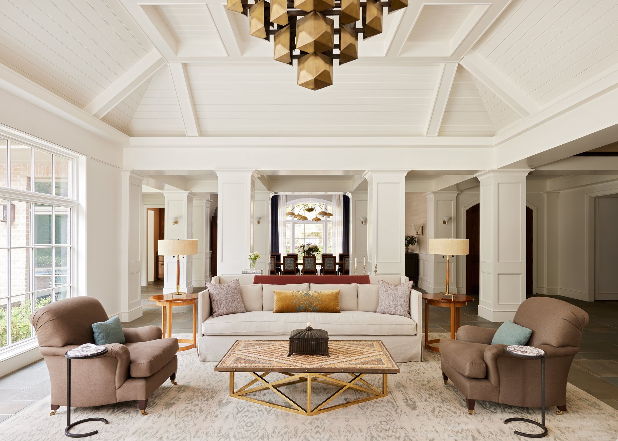
Great room
After Pendant - Blackman Cruz / Sofas - Studiolo / Consoles - Rose Uniacke / Lamps, Console - Vintage
Before
The departure point for the living room was a fireplace mantle that our client’s had purchased in France during their honeymoon. It was sentimental and an architectural element they wanted to keep. We enhanced its presence with a custom stacked stone flue that anchors the room. Additionally we added paneling and beams to the vaulted ceilings for a more refined detailing. The statement pendant adds a contemporary twist. The seating arrangement, while large, is intimate in that we used a limited number of fabrics and textures to unify the space.
Dining Room
After Pendant Remains Lighting / Chair Fabrics - Holland & Sherry + Soie de Lune
Before
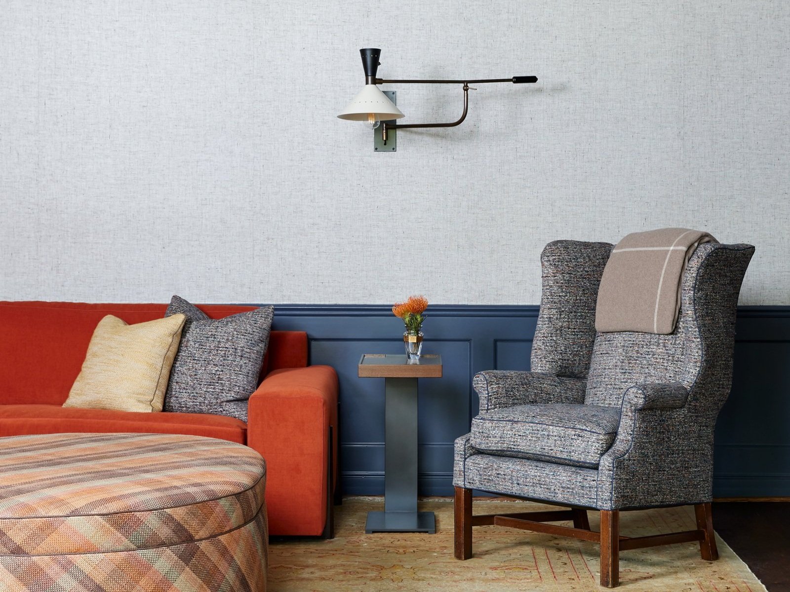
The dining room was previously closed off from the great room and painted a strong rust color. We wanted to combine this space with the living room to create a more open floor plan. The client's asked us to reuse their existing dining table and chairs but give them a new life. We chose to reupholster the chairs in contrasting fabric for the front and back to add dimension to the space. The blue velvet of the chairs is echoed in the deep navy of the drapery panels. We wrapped the room in a grass cloth wallpaper for additional texture. The brass six-dome chandelier adds a sculptural element.
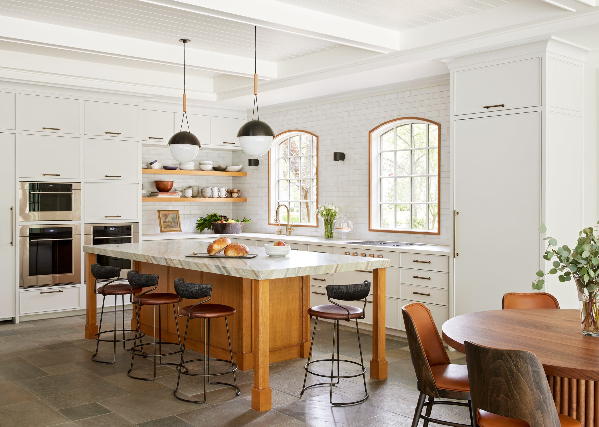
Kitchen
After Pendants - Allied Maker & Plug Lighting / Stools - McGuire / Kitchen Table - Dmitry & Co
Before
Functionally, the kitchen layout worked for the clients, but the clients wanted an aesthetic transformation. In keeping with the light and bright designs of the great room we continued with ceiling beams and trim. The kitchen cabinets themselves are painted a tonal neutral. We replaced the upper corner cabinets with open wood shelving, allowing for the display of daily used pieces and infusing the space with a bit of character. This same wood tone is used at the island which we detailed more like a work table than a transitional island. The light fixtures and counter stools add a modern contrast.
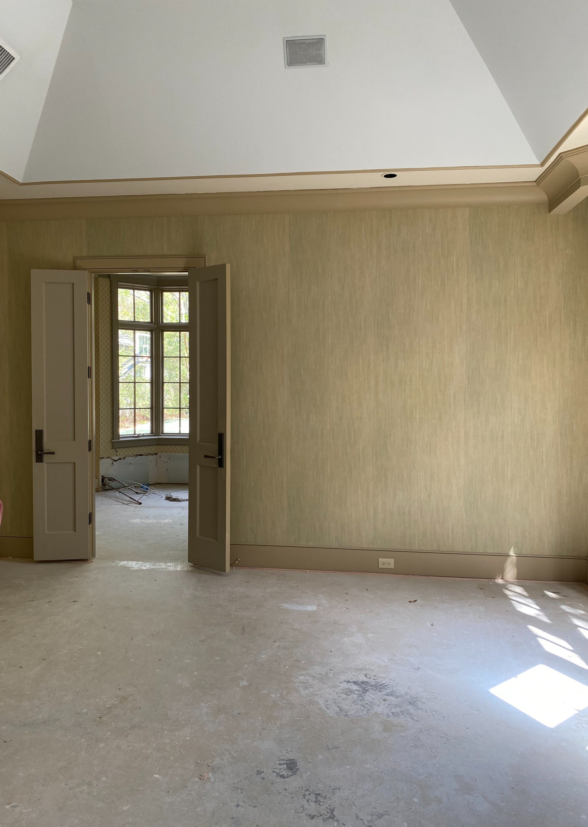
Primary Suite
After Pendant - Vintage / Bed - Dmitry & Co / Bench - Holly Hunt
Afrer
Before
The primary suite previously had olive walls and high vaulted ceilings. We wanted to maintain a sense of scale but in better proportion for a bedroom. To do this we dropped the ceiling, added cove lighting at the perimeter and placed a vintage Italian glass pendant in the center for some drama. Additionally we trimmed the room in tall rectangular panels for a refined look. We often design bedrooms to have a calming color palette which in this case is predominantly warm neutrals with pops of powdery blue for brightness.
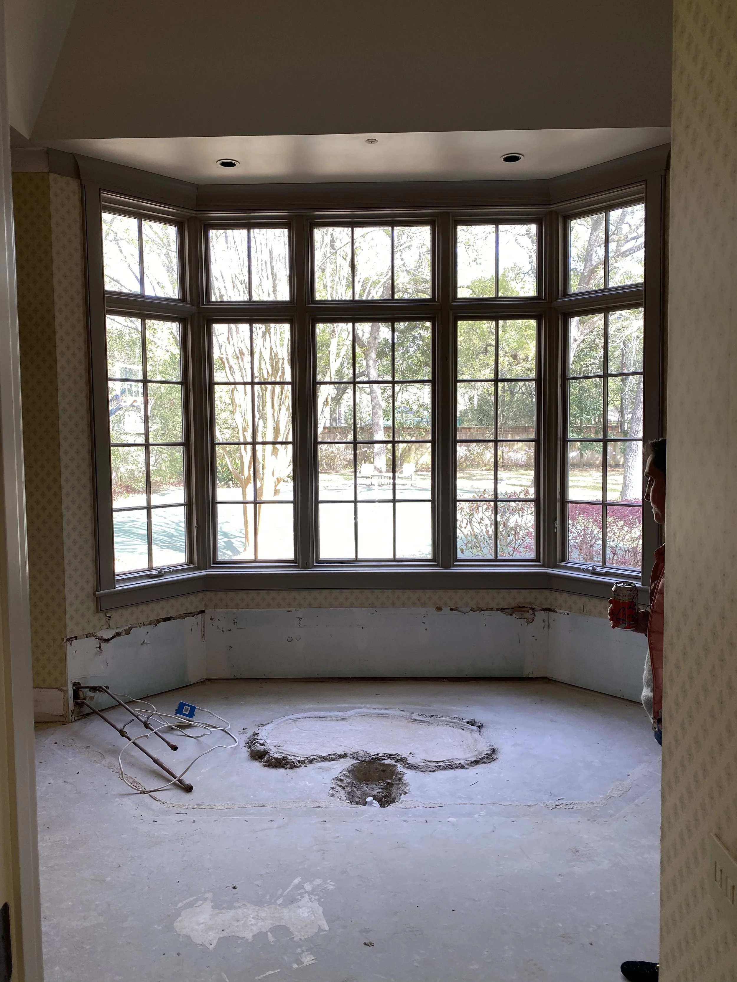
Primary Bath
After Pendant - Ann Morris / Tile - Country Floors / Plumbing - Waterworks
After
Before
The main bath all started with the floor. We fell in love with the subtle but rich patterning of the marble mosaic and wanted it to shine amidst an otherwise light and bright space. The large bay window washes the space in light but we provide privacy with cafe curtains. The freestanding tub adds a more modern, sculptural feel. We designed the vanities to have a furniture-like quality with metal legs and we repeated the paneling detail from the bedroom for consistency. The prismatic glass globe pendant was formerly a street lamp post in Paris that was transformed into a pendant.
study
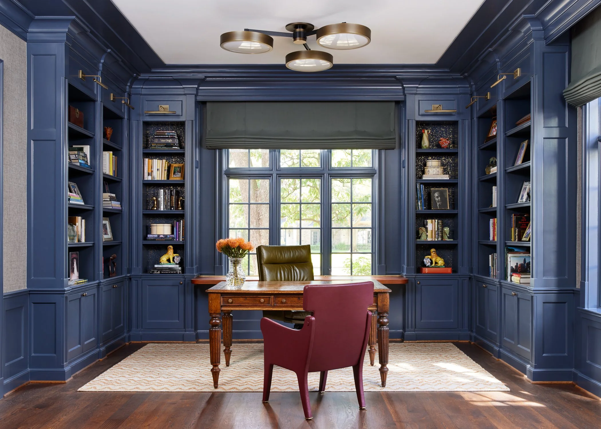
After Paint - Benjamin Moore / Lighting - Urban Electric / Chair - Studiolo
After
Before
The majority of the office casework was in good condition, albeit color that did not exude brightness. We made slight modifications to the Millwork, added sconces at the top and wallpaper at the back and painted. The office was designed to feel inviting, with millwork and casements around the bookshelves that added depth to the space. We installed dark textured wallpaper with a hint of brass to catch glimmers of light and keep the antique desk. We reused our clients desk and paired it with supple leather chairs for a stately yet comfortable aesthetic.

