Interior Architecture

Chicago Lux by Brad Krefman

Spring is in full force, and what better way to melt the winter away than with a space filled with warm woods, rich fabrics, and golden detail? When a Chicago pair decided to update their historic condo, they dreamed of a dwelling that felt classic, yet modern; warm, yet clean. We curated a space derived from detail with an elevated sophistication that speaks to their love of both modern and classic styles.

1.jpg

The Kitchen: BEFORE

The original kitchen’s outdated and yellowing color pallet - as well as the millwork and finishes vocabulary - were reminiscent of a classic suburban Tuscan-style kitchen. While the space should have felt expansive based on its square footage, the dust-collecting cabinet trim and bulky pendant light created a complicated and cluttered feeling. There were no visual queues that referenced the condo’s historic Art Deco heritage.

April-Blog-Block-2.jpg

The Kitchen: AFTER

The clients’ wanted a completely renovated kitchen that was illuminating, modern and functional; yet reflected the building’s Art Deco roots of the early 1920’s. We crafted our design around the clean white cabinets, refreshed ceiling, and brightly polished porcelain floors – all intended to maximize and reflect as much light as possible. The rich, black granite creates a dramatic contrast while the kinetic movement of its veins adds mesmerizing interest. We decided to add warmth to the already luminous space by incorporating walnut at the island and range wall. We further distinguished the island as a piece of furniture, detailing it with a beautiful tambour fascia, a reversed beveled edge at the counter top, and outfitting it with a functional and stylish brass foot rail. To balance the space, we introduced bold and geometric Bauhaus art pieces that reinforce the nod to old world glam.

April-Blog-Block-3.jpg

The Living Room: BEFORE

Similar to the problems found in the kitchen, the clients’ existing living room furniture and finishes were a vestige of their former life in suburban Chicago. These fluffy, over-sized elements no longer fit their new lives as an urban, streamlined duo. Our goal was to elevate the sophistication of the space by introducing a variety of luxurious textiles and finishes while eliminating the extraneous elements that visually clouded the area.

Living-Before.jpg

The Living Room: AFTER

To reinforce the classic Art Deco spirit, we introduced an elegant fan motif in the area rug as well as slightly metallic, golden tonal textures in the upholstery. The layered grass cloth wall coverings add a richness to the room while the over-sized art adds a compelling contemporary twist. The clients’ wanted the area behind the sofa to act as a home office, so we introduced a sleek, sculptural lamp which reinforces the functionality of the desk space. The geometric facets of the black desk drawers evoke the graphic Bauhaus art used in the kitchen.

2.jpg

Mill Valley - Sunny Scandinavian by Brad Krefman

A well-traveled textile and jewelry designer approached us to help renovate her cherished home tucked away in the hills of Mill Valley, California. We designed a bright, functional, and open space with a focus on premium materials and subtle details to set the stage for her family’s worldly collection of pottery, textiles, and art.

Mar-Blog-1.jpg

The Kitchen: BEFORE

One thing not lacking in the original kitchen: cabinets. Lots of them. The cabinets created a heavy, cluttered, fortress feel in an otherwise substantially-sized kitchen. The floorplan was circuitous and far from the ‘open concept’ kitchen that the owner so desperately wanted. The space was very divided from the rest of the home, and the client wanted an area that would bring everyone together. However, there was one gem that couldn’t be overlooked, but rather enhanced… the skylight.

Kitchen.jpg

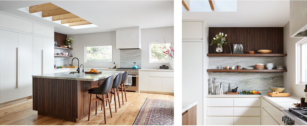
The Kitchen: AFTER

We fully remodeled the kitchen from the ground up, utilizing sleek, bright cabinetry and various wood tones to keep the space grounded and warm. We enlarged the existing skylight so that its proportions mirrored the size of the new island, and we added raw-edge rafters that speak to the reclaimed  flooring material. By installing a unique green quartzite counter and open-shelving back splash, we were able to reflect the coloring of the lush, green surroundings of Mill Valley while retaining a clean, simple aesthetic. We intentionally opted for recessed finger pulls instead of traditional hardware to keep the look modern without being too cold. To reinforce the handmade and craftsman feel that the client wanted to retain, we installed walnut tambour on the island and above the open-shelving. Danish furniture, Miele appliances and Scandinavian accessories elevate the sophisticated character of this kitchen.

Scandi_Kitchen_After.jpg

The Master Bathroom: BEFORE

The master bathroom is located on the first floor of the home and access to natural light is unfortunately somewhat limited. Much like the challenges we faced in the kitchen, the master bathroom felt heavy, closed in, and very out of date. The color of the year may be “Living Coral,” however these soft pink tiles were literally lifeless.

Scandi_Bathroom_Before.jpg

The Master Bathroom: AFTER

Our goal was to visually open the space and create a tranquil getaway filled with light and thoughtful furnishings that reflect the homeowner’s passion for craft and detail. The soaking tub takes center stage which we paired with concrete counters at the vanities and textured tiles in the shower.  This exploration of materiality yields a bespoke and handmade aesthetic, much like the owner’s artistry.

Scandi_Bathroom_After.jpg

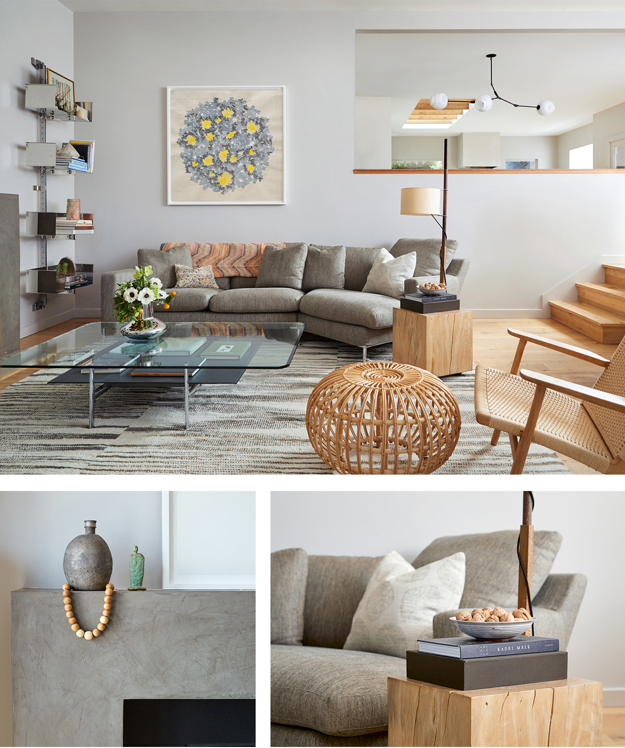
The Updated Living Area

One of the best parts of collaborating with a fellow designer is that they usually already own some incredible pieces - like the chrome-based coffee table and the architectural lamp. We worked with her to source additional elements such as the chandelier, bookcase, rug, and other styling items to bring a clean and cohesive feel to her inspiring, eclectic vibe.

Scandi_Livingroom_After.jpg