A well-traveled textile and jewelry designer approached us to help renovate her cherished home tucked away in the hills of Mill Valley, California. We designed a bright, functional, and open space with a focus on premium materials and subtle details to set the stage for her family’s worldly collection of pottery, textiles, and art.
The Kitchen: BEFORE
One thing not lacking in the original kitchen: cabinets. Lots of them. The cabinets created a heavy, cluttered, fortress feel in an otherwise substantially-sized kitchen. The floorplan was circuitous and far from the ‘open concept’ kitchen that the owner so desperately wanted. The space was very divided from the rest of the home, and the client wanted an area that would bring everyone together. However, there was one gem that couldn’t be overlooked, but rather enhanced… the skylight.
The Kitchen: AFTER
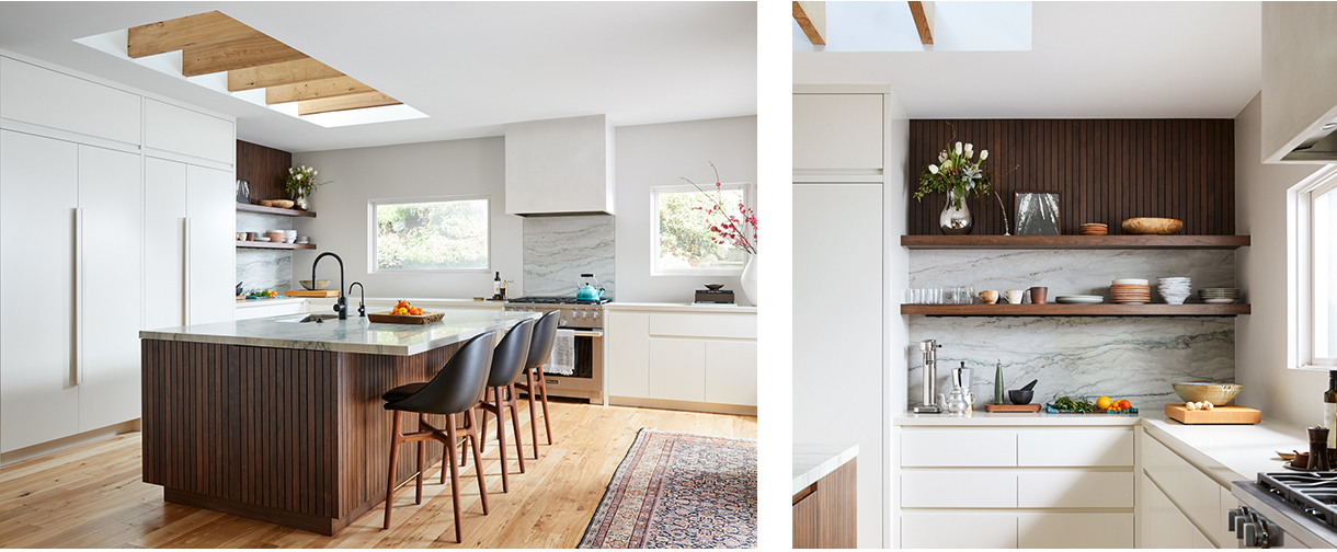
We fully remodeled the kitchen from the ground up, utilizing sleek, bright cabinetry and various wood tones to keep the space grounded and warm. We enlarged the existing skylight so that its proportions mirrored the size of the new island, and we added raw-edge rafters that speak to the reclaimed flooring material. By installing a unique green quartzite counter and open-shelving back splash, we were able to reflect the coloring of the lush, green surroundings of Mill Valley while retaining a clean, simple aesthetic. We intentionally opted for recessed finger pulls instead of traditional hardware to keep the look modern without being too cold. To reinforce the handmade and craftsman feel that the client wanted to retain, we installed walnut tambour on the island and above the open-shelving. Danish furniture, Miele appliances and Scandinavian accessories elevate the sophisticated character of this kitchen.
The Master Bathroom: BEFORE
The master bathroom is located on the first floor of the home and access to natural light is unfortunately somewhat limited. Much like the challenges we faced in the kitchen, the master bathroom felt heavy, closed in, and very out of date. The color of the year may be “Living Coral,” however these soft pink tiles were literally lifeless.
The Master Bathroom: AFTER
Our goal was to visually open the space and create a tranquil getaway filled with light and thoughtful furnishings that reflect the homeowner’s passion for craft and detail. The soaking tub takes center stage which we paired with concrete counters at the vanities and textured tiles in the shower. This exploration of materiality yields a bespoke and handmade aesthetic, much like the owner’s artistry.
The Updated Living Area
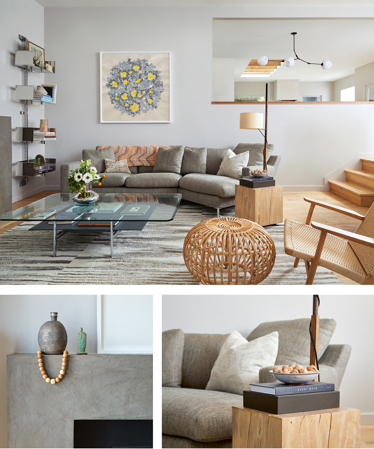
One of the best parts of collaborating with a fellow designer is that they usually already own some incredible pieces - like the chrome-based coffee table and the architectural lamp. We worked with her to source additional elements such as the chandelier, bookcase, rug, and other styling items to bring a clean and cohesive feel to her inspiring, eclectic vibe.


